
At Springload we build simple, functional, beautiful websites. We want our work to be as accessible and usable as possible for every user. In the last 12 months a couple of large projects have made us think about how truly inclusive we’ve been when designing and building these sites.
We’ve put together a list of guiding principles on some pragmatic accessibility tasks that can (and should) be carried out on any project.
Start with good words
The best thing you can do for your users is right at the start: Write good content. We work hard at helping organisations understand the importance of writing great content for their users. Start simple: Write concise descriptive content. Use headings well. Write link text that explains clearly what will happen if a person clicks that link. (No one wants to be clueless about where a link might be taking them. And no content writer wants to be told they are using “weak text” for links.)
Also: There is definitely a wrong and right way to talk about people with disabilities. I found this article useful when I was a little uncertain if I could be causing offence. There is a paragraph at the bottom of this NZ web toolkit article which explains how to use respectful language.
Know the government standards
It’s important to note that government entities might have their own standards – and highly tested ones at that. Do your research before you start. Here are some great resources:
Adhere to the design basics
There are basic things that should be considered during the design process:
Making headings look like headings
Making links look like links
Adding proper focus states
Giving content a clear hierarchy
Making form elements as simple as possible
And here’s a big one: Don’t re-engineer common elements without a really good reason.
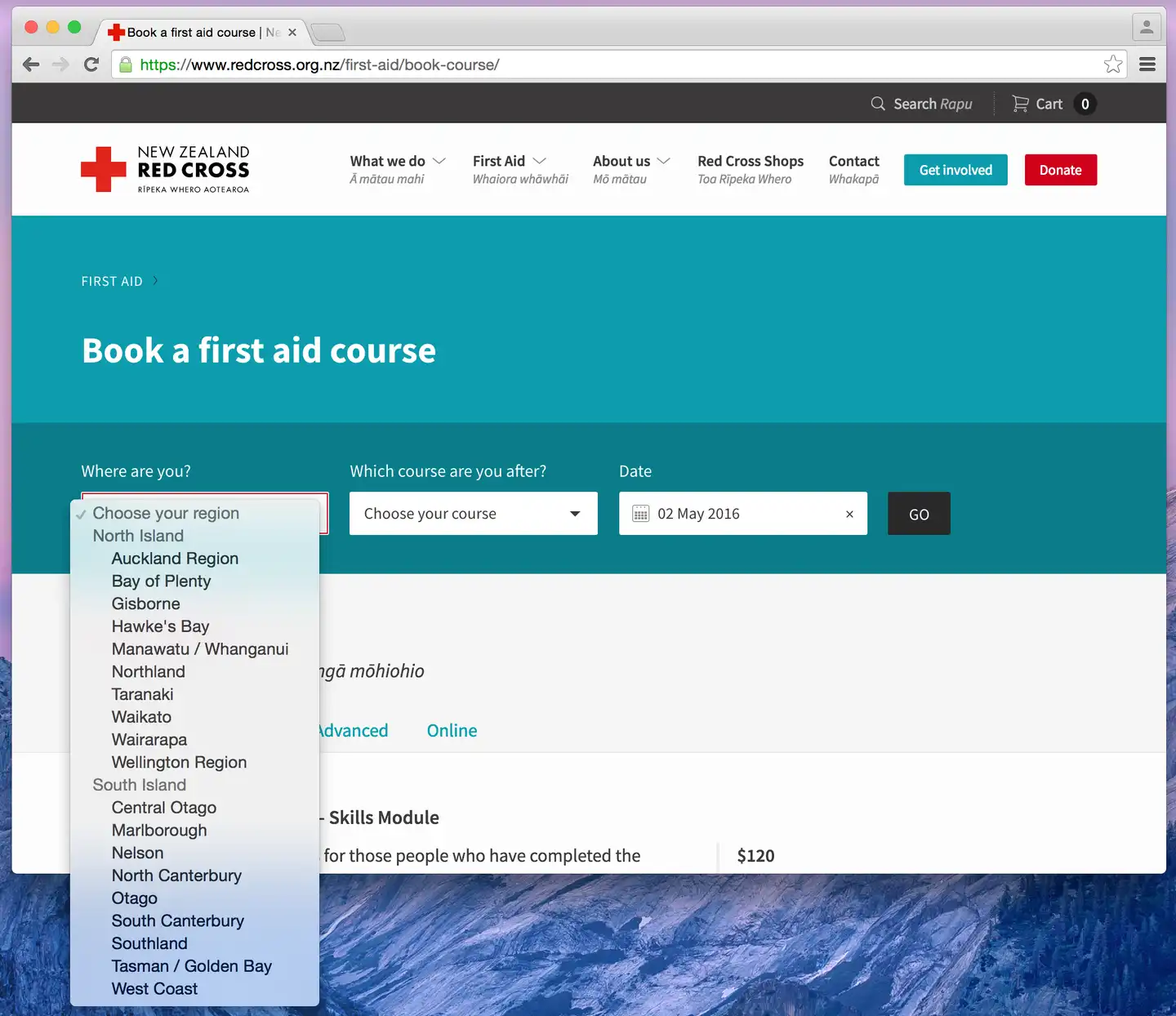
For example: browsers already handle a lot of edge cases with selects (see image below), so you need a damn good reason to go and design custom UI for select dropdowns. Choosing that path will require you to solve nontrivial problems the browser solves natively, like: What do you do if there's too many items? What happens when a select is close to a screen edge?
And what happens when you hit tab? Keyboard controls – tab, space and arrow keys – all work natively in your browser. Any custom select is not finished until this is done and there can be a lot of work to get there. Simplicity is key.
Tick off the accessibility must-dos
Use the right markup
This should be an easy one. Using the right HTML tags and attributes can greatly improve the accessibility of a website.
Use the language attribute on HTML tags
Identify the default language of a web page. This helps screen readers pronounce or render the content correctly.
<html lang="en-nz"></html>
<html lang="mi"></html>
Read more about setting the language of your page.
Always use the alt attribute for images
Don’t just use it – make sure it’s appropriate. This is what the screen reader will read. Keep in mind that you may have to give clients special instructions on the importance of adding this if they are loading images in a CMS.
Always include all text that appears in an image. For example, New Zealand has two official written languages, English and Māori. It’s common for organisations to include a Māori translation in their logo – this translation text should also feature in the alt attribute.

If you have to use an image for decoration only (like a special list bullet style or divider line), you can use an empty alt attribute and the screen reader will skip over it; however, with no alt attribute at all the screen reader will still do something with it, which may include reading out a very long file path – super unhelpful. See some examples that show how to use empty alt attributes. We recommend using CSS to style anything that is purely decorative though.
Read more about the importance of using alt text for images
Pay close attention to focus states – they’re important
Despite its importance, this is something that frequently gets missed. Many users with disabilities rely on a keyboard, and a keyboard user requires a visual indicator for the element that holds current focus.
If you customise the focus state, stylistically it’s not great when you get that brief flash of an outline every time you click any link. There are two viable options to address this:
Avoid outline: 0 or any other styles that remove default focus states for links and other elements. The default focus state doesn’t give you this “on click outline flash” and has a nice obvious active state.
If you do want to use focus state that’s more aligned to your design system, you can use a small snippet of CSS and JS to add custom focus without the flash. We do this by adding an empty style tag after our main stylesheet, and on tab we add focus styles and respectively remove them when no longer tabbing. See how this tab access focus state works.
If you’ve got any other solutions, let us know on Twitter.
Find out more about keyboard accessibility from webaim.org.
Links should always have descriptive content
Always use descriptive content to convey the purpose of the link for everyone.
If you install an accessibility developer tool and run an audit on your page, the most common warning you’ll get is that the purpose of each link isn’t clear from the link text. Example of a link with unclear purpose:
<a href="https://www.springload.co.nz/services/">
    Read more
</a>
There are a couple of ways you could fix this:
Write more descriptive link text:
<a href="https://www.springload.co.nz/services/">
    Read more about what work we do at Springload.
</a>
Give your link programmatic context.
A Heading and paragraph act as link context meaning you can use slightly shorter less descriptive links when included inside the paragraph element.
<h2>Springload</h2>
<p>
    We create award-winning websites and apps that improve people’s lives.
    <a href="https://www.springload.co.nz/services/">Read more</a>
</p>
Icons as links
We use inline SVG for all our icon links, so it’s not an image that can use alt text to describe link content. We need to make sure we include proper text somewhere to give the link an accessible name. On older projects we’ve used a span with text and made it hidden but accessible, for example:
<a href="http://www.springload.co.nz/">
    <span class=”u-accessible”>Link to Springload website</span>
    <svg class="i i-white i-springload">
        <use xmlns:xlink="http://www.w3.org/1999/xlink" xlink:href="#i-springload-logo"></use>
    </svg>
</a>
Nowadays we use the SVG title element. Here are some more tips for making SVG accessible.
Additional accessibility features we consider important
Some of these receive less attention than accessibility features outlined above – but we consider them no less important.
Have labels surround inputs (Springload preference)
Label and input fields should be organised so they make sense when read in the order they appear in the code. The label can be before, after, or around but using around means we don’t have to use the “for” and corresponding “id” attribute everywhere. Plus, it’s tidier to read.
So, more like this:
<label>
    Firstname
    <input name=”thing” />
</label>
As opposed to this:
<label for=”thing”>First name</label>
<input name=”thing” id=”thing” />
Always have a label
On the subject of labels: we recently had a discussion in one of our workshops about instances where a label might not make sense visually. For example: the search form, or a newsletter subscribe in the footer – these notoriously don’t have a label. You should always have a label, just hide it from view. We mostly use a utility class, which hides something from the viewer but not from screen readers. Screen readers skip content that is display: none.
<form method="get" role="search">
<label class="u-accessible">
Enter your search term
</label>
<input type="text" name="q" />
<input class="btn btn--primary" type="submit" value="Search">
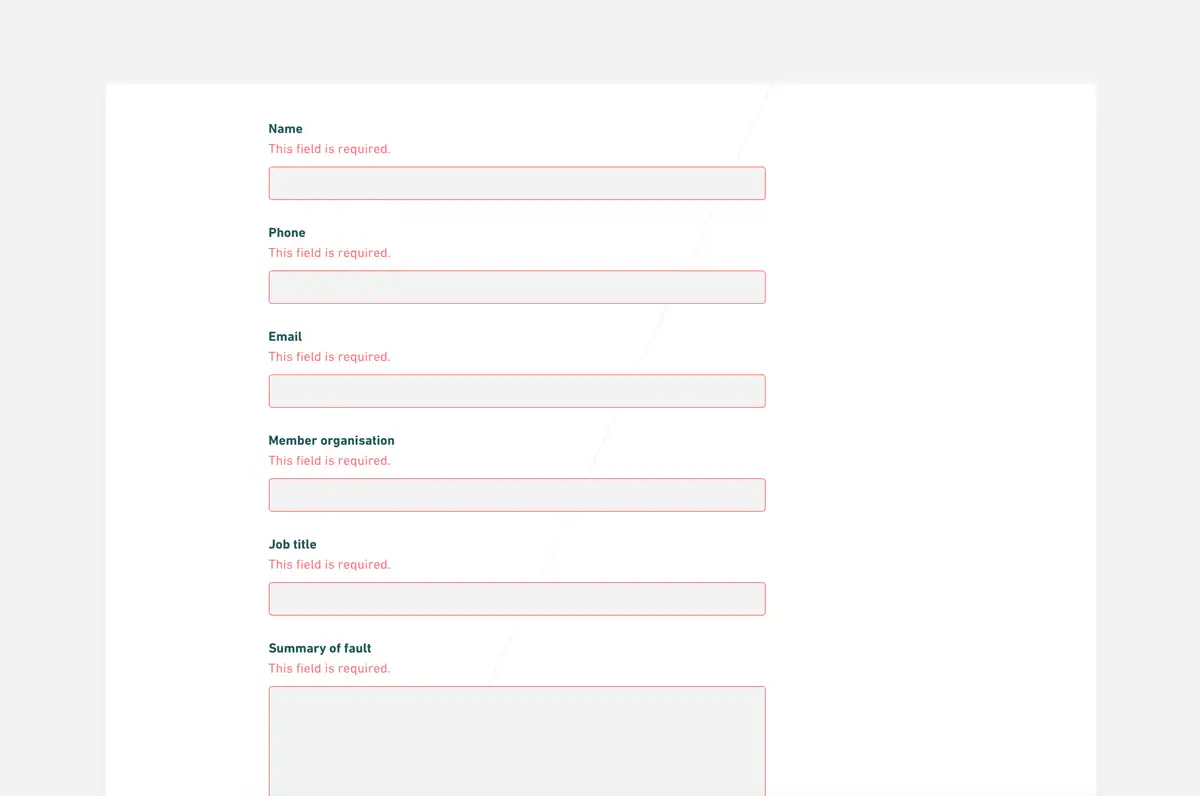
</form>Put error messages inside labels
This is a more logical and efficient way to relay information when someone has made an error in a form. Because screen readers navigate through forms using field focus, placing this important information inside the label allows the screen reader to read it when the control receives focus. Read more about building usable forms.
Avoid title attributes on links – they’re not useful
Link title text makes your website less accessible. It won’t get read out by screen readers, and it can make it difficult to navigate if the title tooltip is content-obstructive when zoomed in. Read more about the limitations of the title attribute.
Assign major roles to content – a case for ARIA roles over HTML5
ARIA (Accessible Rich Internet Applications) roles give meaning to otherwise ambiguous parts of your markup. Use for navigation, for example:
banner for your header
main for site content
contentinfo for the footer
We have also used:
complementary for sidebar content
search for search forms
form for forms
navigation for navigation
tablist for tab triggers
tabpanel for tab content
<div role="banner" class="header" >
	<div role="navigation" class="nav"></div>
</div>

<div role="main" class="site-content"></div>

<div role="complementary" class="sidebar"></div>

<div role="contentinfo" class="footer"></div>
Using HTML5 elements would mean we don’t have to use ARIA roles. But we don’t use HTML5 markup – mainly to avoid including unnecessary JS and CSS specifically for older browsers. Assigning roles is a pragmatic compromise.
I can hear you saying ‘Why bother supporting ancient browsers?’ Two reasons:
We do still have clients that require support for pretty old browsers like IE8 or IE9. For the sake of consistency within our dev team we just blanket don’t use HTML5 across all projects.
As a community, we should be designing and building things for use by people with a wide range of abilities. You can take each project as it comes, but it’s important to analyse your audience before you automatically exclude tools that are less desirable to you.
We’ve also spent time wondering: Is it accurate to say screen readers make use of HTML5 elements or ARIA roles consistently? There is a lot of conflicting information on the web about this. Depending on browser and assistive technology combinations, screen reader results vary. There are many other ways to navigate a site, like using headings. This uncertainty only reinforces the need for properly structured HTML and content.
We’re aware that the exclusion of HTML5 elements is disputable. We’d love to hear a conclusive argument as to why we should use HTML5 instead.
Use ARIA attributes for custom UI
These attributes are specifically for when you build custom UI components that don’t have native semantics and state indicators. Using ARIA attributes might be as simple as adding aria-hidden and aria-expanded when you change any content display state with JS. One example is toggling content. This is a great time to use aria attributes to indicate a standard div with no semantics is behaving like a tabpanel or popup. You’ll want to use a combination of aria-hidden, aria-expanded, aria-labelledby, and aria-controls. You could also use aria-haspopup, role tablist, tab, and tabpanel. Here's an example of how we use ARIA on dropdown menus.
Note, however, that reengineering elements with free and native behaviour is not our recommended option. Proceed conservatively with ARIA states.
Here is a more extensive list of ARIA techniques you could research and use. It’s also nice to read more about what others in the wider community are doing with ARIA. These simple examples are also a nice place to see simple ways to use ARIA.
Use skip navigation links
Access keys
When you have the right markup and content roles assigned access keys (or ‘hot keys’) are not necessary, especially on sites where users might only visit once or twice. They can be useful if your site is likely to have regularly returning users.
Even though it’s not necessarily a top priority, access keys can be useful for every kind of user. They’re a navigation tool to help you get around a website (quickly) using your keyboard. Read more about access keys.
Skip to content
Skip-to-content links are useful to avoid having to tab through any/many navigation links on a site before you get to main content. The ARIA role main or the HTML5 main element will be what is used by assistive technologies like screen readers; skip-to-content links are for keyboard navigation.
Read a more comprehensive piece about skip navigation links.
Some closing thoughts
This is by no means an exhaustive accessibility guide – these are just some pragmatic things that have helped us. Shout out to Jason Kiss from the Department of Internal Affairs for prompting and guiding us to improve when we worked on a project for the New Zealand government.
Contact us if you feel like telling us we’re wrong about anything – we love a bit of healthy criticism and advice.
Need help with Accessibility?
If you want to know more about how to implement some of these techniques, or want help making your project more accessible, get in touch.
Get in touch
Let’s make the things that matter, better.
Email: hello@springload.co.nz
Phone: +64 4 801 8205