Sure, I don’t expect everyone to be as excited as I am about the release of the latest seasonally adjusted chain-volume GDP – but I do think that basic data literacy is becoming a vital part of running a successful business, or being an informed citizen.
In New Zealand and the rest of the world, the trend has always leaned towards siloing data in an organisation’s information system. These obscure spreadsheets are now in the public eye, and it’s time to make this data accessible to a larger audience so they can visualise it, analyse it, and explore it, all in the open.
We’re going to take a look at uncharted datasets to reveal their full potential.
Gathering the data
When data is involved in the production of a digital project, the content, shape and size of the datasets are crucial for the entire process. The data will inform creative and technical decisions, and it’s paramount to start a project with a thorough assessment of this raw material. Here are the 2 main questions to answer right from the start:
Ownership – Who is responsible for the data?
The data needs to be clean, structured, and complete. If it’s not, it’s important to understand whose responsibility it is to transform the data to suit the needs of the project. Ideally, those transformations will be done as part of existing data massaging operations. Otherwise, transformations can be ad hoc – and prone to manual error.
Getting the data into a usable shape can take some time, so it’s important to ensure the person or team doing this work has the appropriate workflows and tools. It’s worth mentioning recent initiatives in this space:
- Data Packages, a project of the OKFN
- Dat, originally described as “git for data”
Value – What stories can the data tell?
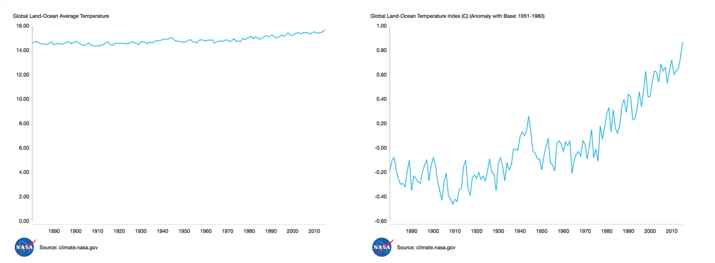
A single dataset can tell many stories. Here’s a famous example of two graphs of the same dataset: our planet’s global surface temperature changes from 1880 to 2016.

Both charts represent the same underlying data, but one displays it as yearly average temperature with a 0 - 16ºC scale, while the other displays it as a change index on a much smaller scale. Which of these two stories would you want to tell? The choice is yours – the data can be interpreted very differently depending on how it is visualised. Will you present the data as-is, or tell a story?
Dataset insights
A domain expert will get the project team up to speed, and be ready to vulgarise their domain knowledge for other stakeholders. They’ll also likely know of interesting patterns and trends in the data. This existing knowledge will inform early data exploration, and kick off the creative process, too.
Data visualisation projects are positioned on a continuous spectrum from narrative pieces in publications to exploratory, “app” experiences. Where a project sits depends on the nature and scale of the data, and it’s important for this to be decided early on.
It’s easier to aggregate and interpret the data for story-telling pieces – where it can be a manual process – than for exploratory tools, where it has to be automated due to the scale. Another factor is the level of technicality required to make sense of the data compared to the audience a project aims for: what units are the measures in? What vocabulary do the labels come from? To answer those questions, we need to go data exploring.
Exploring datasets
So, you’ve got your hands on those juicy datasets. You’ve been told many tales about what lies inside them. Now it’s time to put them to the test.
Dimensions and data types
To understand a dataset, look at what makes up a single data point. Is it a number with a date, as in a time series? Is the number absolute (eg. a quantity) or relative (eg. $ per capita)? The most important types to look for are:
Coordinates – indicate the data is geolocalised and could be displayed on a map, or filtered by area.
Dates – with time series data, you’ll be able to show people how a phenomenon evolves over time.
Text – labels or categories, forming nominal or ordinal scales. Ask yourself whether those are understandable by your audience or not.
Numbers, relative & absolute – look for the distribution of those values, whether there are hard extremes (eg. % of population is always between 0 and 100%).
You should also take a look at the available metadata, particularly if there’s a high number of datasets and your audience needs to navigate between them. Talking about navigation – now’s the time to look for the dimensions within your data. Look at how the data is structured, and how many hierarchy levels there are. A uni-dimensional dataset (eg. population of a single country over time) is easier to visualise than a multi-dimensional dataset (eg. population over time, by country; population over time, by country and by age group).
Start with a spreadsheet program (Excel, Google Sheets, etc). For coders, R is worth learning (particularly when working with statistics). While cleaning the data, OpenRefine is also worth trying before making the move to visualisation tools.
Exploratory visualisation, dimensions and trends
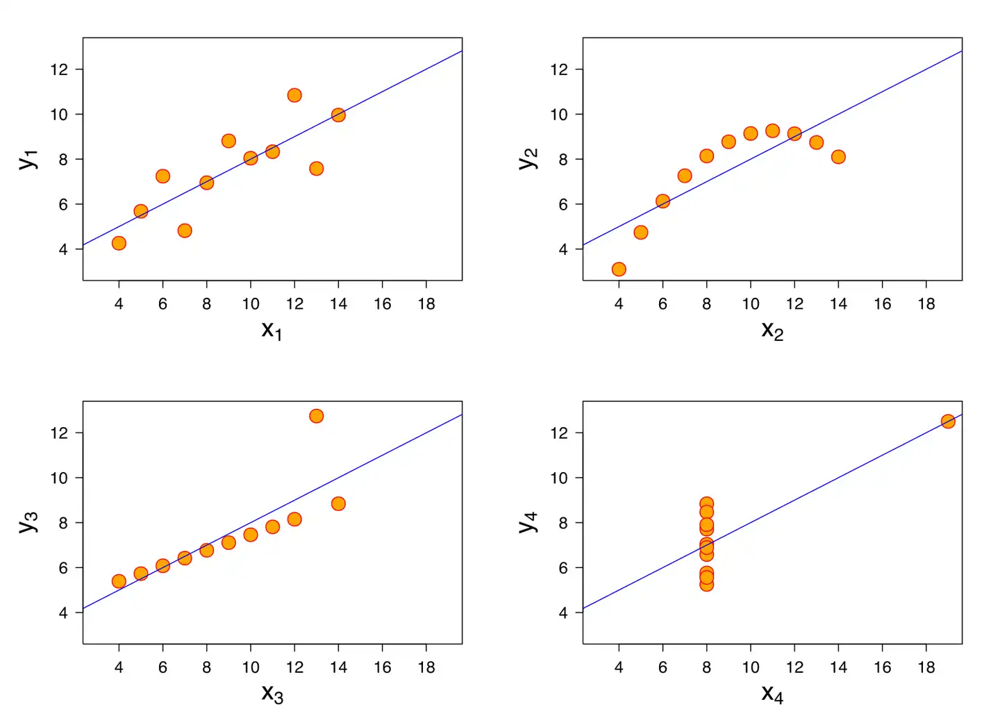
Ever heard of Anscombe’s quartet?

These four datasets have very similar statistical properties (mean, variance, linear regression, etc) while being wildly different in their actual distribution.
When looking at those datasets from the most common statistical lenses, they are nearly identical. But charting them makes it crystal clear that different patterns are going on. This illustrates perfectly why it’s critical to visualise data to understand it better. The overall distribution (“shape”) of the data will be much clearer by being visually encoded than inferred from the underlying numbers, and statistical properties.
Visualising data takes time, but there are many tools available that can help you with graph building and beyond:
Google Sheets has an "Explore" feature available out of the box, automatically generating (mostly) relevant charts and insights.
IBM Watson Analytics is another approach, also providing automatic chart generation and visual data exploration (expert).
Wicked Data is a new contender in the exploratory visualisation space, with configurable drill-downs and chart types, as well as dashboards.
Early prototyping
Prototyping puts understanding the data to the test. While I mainly advocate for prototyping with code for the purpose of discovering the data, it’s also important to create wireframes and visual mockups as part of the larger design process. Two areas in particular benefit from prototyping: chart types and features to manipulate the visualisations.
Chart types
There are lots of visualisation types out there, each with a different purpose. The Data Visualisation Catalogue lets you build quick and dirty versions of certain chart types helping you highlight the tradeoffs of each type in respect to the data being visualised, while surfacing more issues with the data (missing labels, duplicate data points, etc, too.
Here you can explore which chart components are important: a grid, labels and legends for the data, axis and their label, etc. Think of how to make the data understandable for the target audience, and how to highlight elements that contribute to the overall story. Try different scales for the axis so different patterns are exposed. Look at how animation and transitions could be used to further emphasise the chart’s story.
Here are some more things to consider at this stage:
How should missing data points (“holes”) appear on the visualisation?
How are the minimum and maximum values (“domains”) on the axis selected?
- Are there particular data points that need to be highlighted?

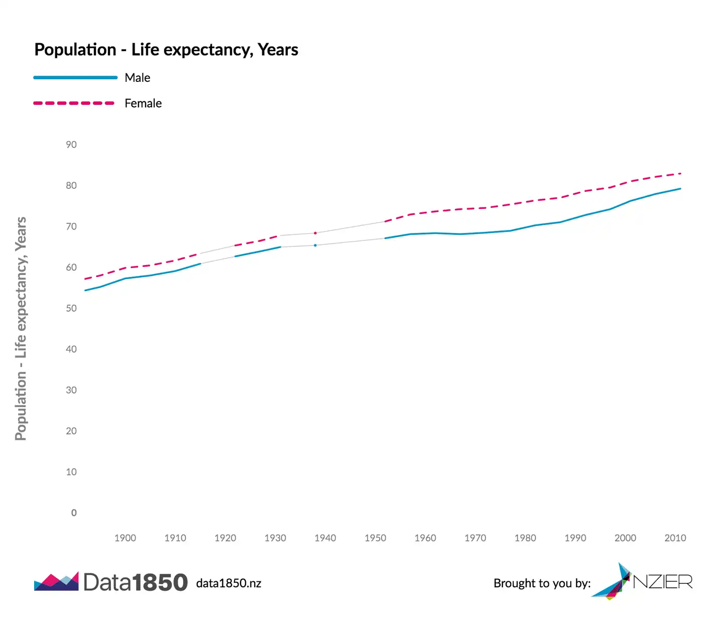
The above graph shows the life expectancy in New Zealand from 1892 to 2011 by gender. The life expectancy axis has graduations from 0 to 100 years, while lines are rising from the 50-60 range to the 70-80 range in present days. There are holes in the time series from 1915 to 1922, and 1931 to 1952 that contribute to the story as they correspond to periods of war. Starting the life expectancy scale at 0 makes the lines overall flatter, reducing the gradient of the line and thus the importance of changes. Tradeoffs left and right.
Visualisation features
Building actual charts makes the complexity of the data more apparent. Perhaps it’s too big and needs to be filtered. Perhaps it’s split by categories and needs grouping. The need for certain features can be informed by prototyping. This is particularly important for exploratory experiences, while ready-made stories might not benefit from interactivity.
Here are three questions to guide the prototype’s direction:
Is the dataset complex enough that it does not “fit” on one chart because of its length or number of dimensions? If so, add filtering (time-based or category-based) or facets. Those can be done on the chart (eg. pan & zoom for maps and time series), or separately with UI components.
Would the user be interested in the values of specific data points? A tooltip, cursor, or toggle on the chart elements could make the values selectable within the chart.
Is the chart making assumptions that users might want to change (eg. units of measure, default zoom level / filtered period, default coordinates, order of categories)? Good defaults are important, but adding a way to change them might make the chart useful to more people.
These questions only scratch the surface because a real prototype must explore many other factors, from legibility on small screens to data loading performance.
Over to you
There are a lot of parameters to keep in mind when discovering data. For now, this process is likely to keep being a manual expert task with the growing popularity of the open data field better tools are being created. Chart platforms like Atlas and the kiwi Figure.NZ promise to simplify the path from messy data to beautiful visualisations. Initiatives like the Data Futures Partnership will foster open data availability and overall quality. Now that you know how to chart your data and the tools available, it’s up to you to start experimenting.
The next blog posts in this series will be about how we build beautiful, advanced visualisations with React and D3. Get in touch for more information on how we can help you building fully functional prototypes with your organisation’s data.
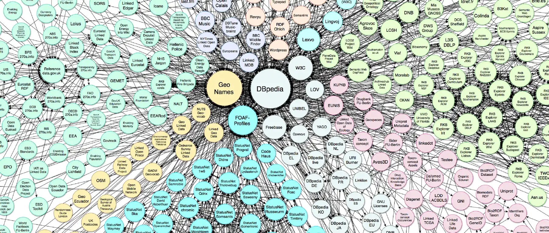
Hero image: Linking Open Data cloud diagram, by A. Abele, J. P. McCrae, P. Buitelaar, A. Jentzsch and R. Cyganiak.
Temperature data: NASA/GISS
Anscombe quartet graph: Wikimedia user Schutz
Get in touch
Let’s make the things that matter, better.
Email: hello@springload.co.nz
Phone: +64 4 801 8205