What is IA?
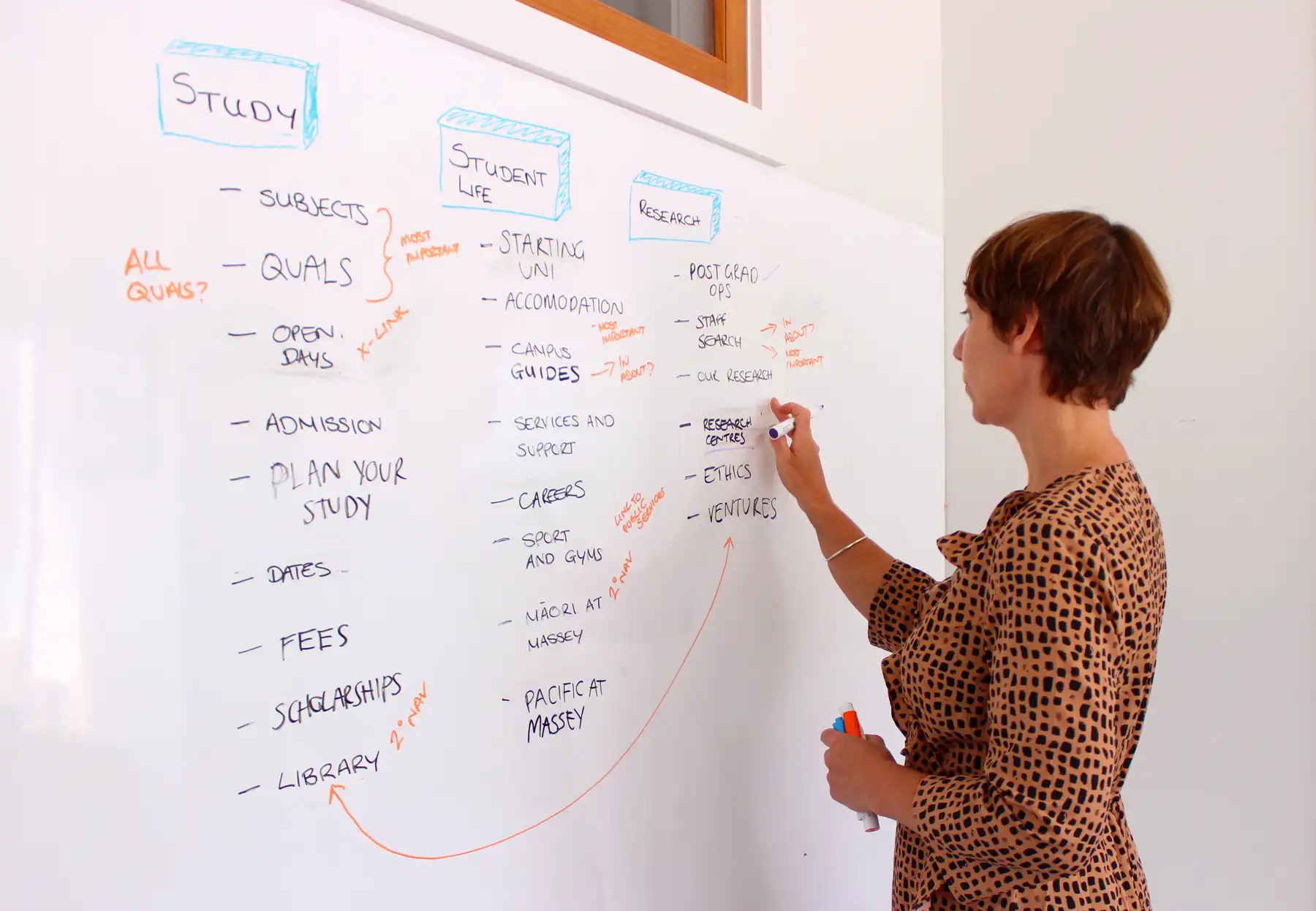
Information architecture, or IA, gives content structure. It dictates how content on a website or app is grouped and labelled — in UX speak we call this taxonomy. Whether a menu is organised into “starters, mains and desserts”, or “vegetarian, vegan and gluten free” is an example of taxonomy at work.
IA also governs where content sits and how it is surfaced. For example:
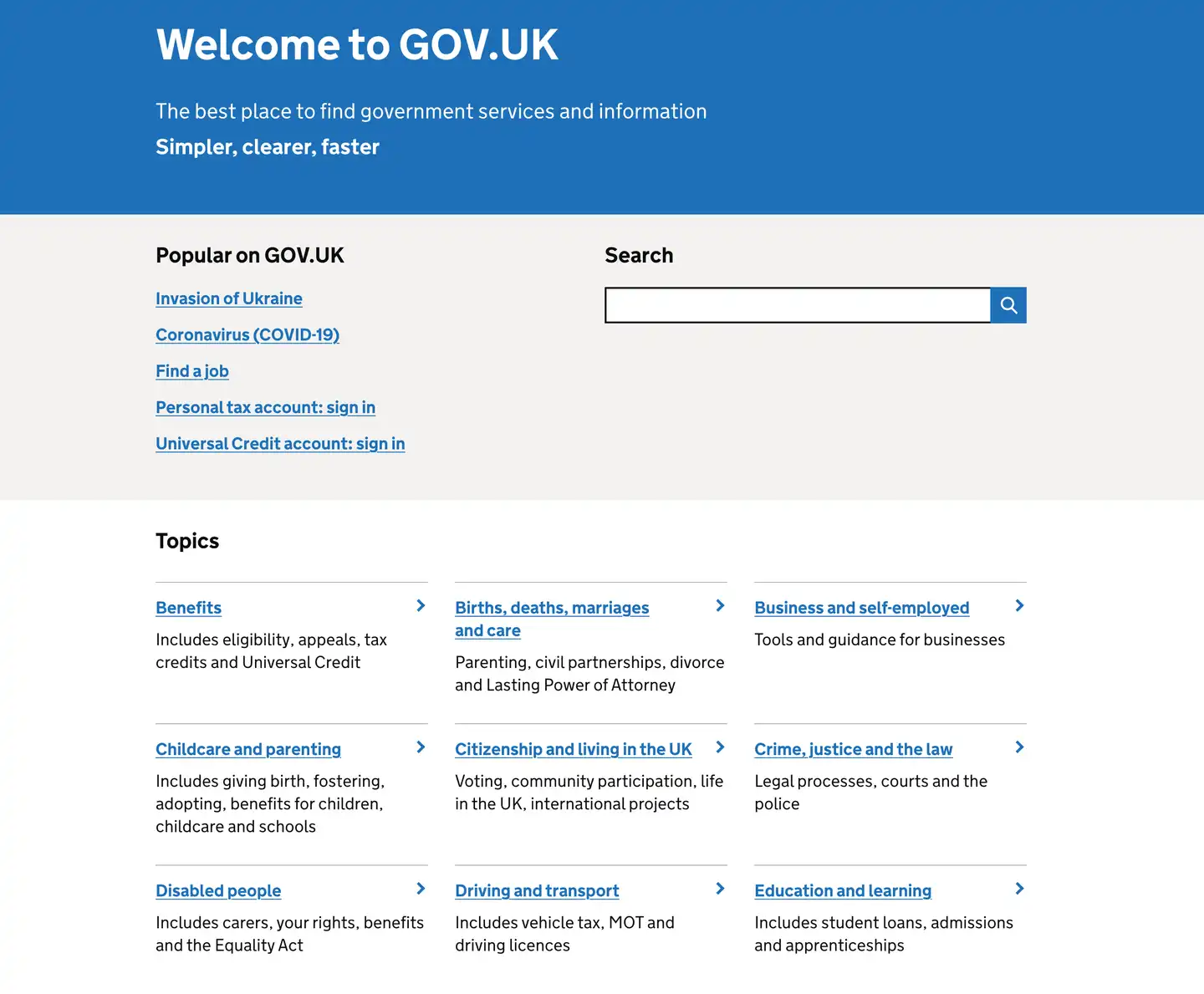
- via the homepage navigation, or from a page a few clicks down
- how content displays on different devices such as mobile, desktop, tablet or smart watch
- how content is organised in your search tool.
Why IAs need thought and attention
Good information architecture helps people find what they need to efficiently. IAs are like the foundations and joists of a building — they need to be solid and built first, or the overall experience is shaky.
It’s a good idea to keep an eye on how your IA works for key customer journeys and content over time — as well as when thinking about new digital projects. As information grows organically, metaphorical rafters and walls can need moving, or bracing, to help guide people more easily through your app or site.

How IA and other UX design work hand in hand
A well thought out IA alone won’t make things easy to find. Other user experience (UX) design elements need to come to the party. At Springload we work closely across disciplines, for this reason.
It’s also why we seldom rely solely on IA recommendations when reviewing or redesigning a client’s IA.
Also affecting a users’ experience:
Visual design: Are menus and calls to action in an obvious place? Does imagery support written content rather than distract? Is there enough space between text?
Content design: Is copy clear, concise and scannable? Is it logically structured? Do calls to action make it clear what people should do next?
Component and template design: Do the site’s building blocks display and work well across all devices? Are they accessible for all users?

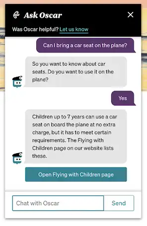
Air NZ chatbot, Oscar
Do you even need a website? Metadata drives the classification of information in chatbots — and it's important that information is classified and labelled in the same way between your website, intranet, chatbot and any other channels you have.
Steps to designing an IA
Discover
Before designing an IA understand these six things:
1. Strategy and goals
Knowing what’s important to your business from the outset is best. Your strategy documents such as service blueprints, content strategy, your channel strategy, customer journey maps and brand strategy will ideally be up to date before you start the IA design process.
Being clear about technology goals is also important. For example, do you need to plan for structured or personalised content, or voice commands?
Having a common understanding of these strategic aims from the start means you can design your IA to meet them and allow for any constraints.
2. Stakeholders
When designing your IA, it’s important to go wide across key areas of your business.
Understand how the website supports what different business or product groups are trying to achieve. Ask for their perceptions of customer goals, priorities and pain points. Check what they need the website to do, and what a good web experience looks like to them.
3. Customers
Knowing how users behave online, their preferences, mindset, and objectives is at the heart of any good user experience. This is the most important, and sadly most often under-scoped, part of the IA design process.
We like to do:
- user testing — to observe first-hand how people move around, anything that is working well and any challenges
- analytics data review — for a data-driven take on user behaviour
- customer interviews — to dig into their motivations and needs
- top tasks survey — to find out what people most want to do on the app or site
- card sorts — to see how users naturally group and label your content.
We do this on behalf of, or with our clients, depending on their set up. If clients have already carried out some or all of these steps, we analyse their data.
4. Content and components
For existing apps and sites, review what content is already there and note any new content planned. Look at how contents and components stack up against best practice. Plus assess how they serve customer and business needs. For new sites or apps, be clear on what content is planned and what form it will take.
5. Current IA
If you already have an IA, test how easy it is to find key information. This will flag problems. It also gives you something to measure your new IA against.
We use a treejack survey, in-person or remote live testing, or a combination of both. Turn to your customer research such as top tasks to decide what content is ‘key’.
6. Competitor and similar apps or sites
Seeing how competitors and businesses and services with similar needs approach their IAs provides extra insights for your IA design.This is often called a landscape review.
Design
Once you understand these six things, you’re good to go. Make sure you test draft designs to see how they perform. We use tree testing, user testing and card sorts. Depending on the results, iterate, rinse and repeat.
Get in touch
Let’s make the things that matter, better.
Email: hello@springload.co.nz
Phone: +64 4 801 8205