When properly crafted, microcopy is your ally in increasing brand loyalty, reducing cognitive load, and alleviating user uncertainty. But what’s so wondrous about these typically tiny lines of text?
It’s just copy … but smaller?
Sort of. Microcopy is best thought of as instructional snippets of text that guide a user through an interface. It gives clear feedback from actions, prods you on to the next step, and sets expectations. You’ll find microcopy in:
search prompts in search fields
placeholder text in form-fills
confirmation messages
labels on buttons
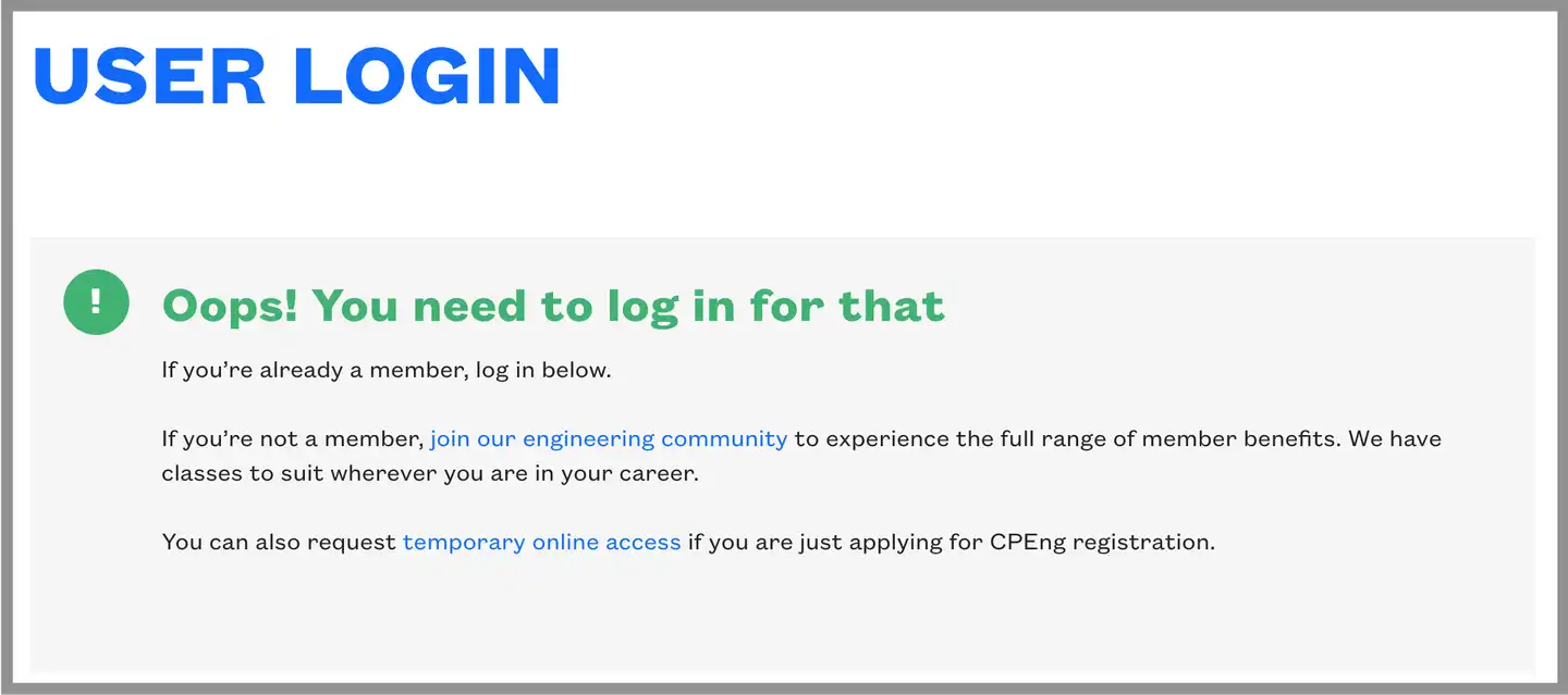
error messages
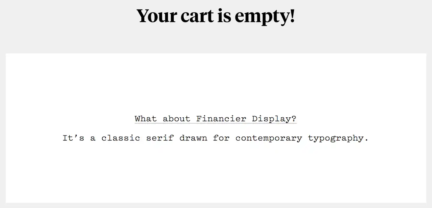
404 pages.
These phrases – or even single words – are short, snappy, user-oriented, and contextual. You might have heard it referred to as UX copy (or microinteractions), though some would argue it’s more versatile – and much more powerful. Like good design, if microcopy is doing its job well, you won’t even notice.

Take action with microcopy
You’ll find microcopy intertwined with every single user interaction on a website, in an app, and even your phone’s interface. Effective microcopy helps a user to do the thing they need to do with a minimal amount of fuss. It’s about crafting a voice that speaks to a user’s unspoken concerns while supporting your business’ goals. Let’s take a look at when these phrases are best deployed.
1. Motivating your user prior to taking action
Here’s the situation: you’re trying to get a user to sign up to your newsletter of life-changing tips and tricks. Give them a little nudge of encouragement to take action. Try a harmless humblebrag about how many other people have signed up this week. Make them feel like they’re about to make the best decision they’ve made all day.
2. Taking action
No time for nonsense, the user just wants to get down to business. Clear, direct and functional microcopy that usually boils down to a call to action, for instance ‘buy now’ or ‘submit’.
3. Feedback after a user takes a particular action
Woohoo! They’ve signed up/bought your product/chosen a unique username! Yes, even that is cause for a little celebration. Congratulate them with a timely word of enthusiastic praise. Reinforce their good decision and encourage them to come back. If something goes wrong, an error message infused with a bit of personality, and humour, lessens the impact. Context is everything, so make sure your approach aligns with your brand voice.
The best microcopy takes these otherwise solely functional, lifeless interactions and transforms them into a moment of expressive brand communication. It recognises your user as a human by talking to them like one. And people notice. By reassuring your users through microcopy, not only are you increasing conversions in the short term, but also engendering brand loyalty in the long term.

Let users hear your voice
When it comes to giving voice to your brand, microcopy is often an overlooked opportunity. Which is a shame, because it’s one of those places where it’s most warmly received. The idea is to get a dash of your brand’s personality across to the user – without getting in the way of usability.
Microcopy is often described as branding’s strongest ally, but this depends on what users want to get from your brand. If they want clarity and certainty, you might want to communicate in a way that’s more formal and traditional. However, if your brand is more akin to a disruptive startup, some tongue-in-cheek humour wouldn’t look out of place. In either case, the copy must be clear and concise.
Minimise cognitive (over)load
A few simple words delivered in the right context can help minimise a user’s cognitive load. What’s cognitive load? In our case, it’s essentially how much concentration it takes to understand and interact with your website.
From beginning to end, your user flow should be clear, easy and unambiguous. Your user should know exactly what pressing a button will do and where they’ll end up.
There’s nothing worse than a UI that gets in the way of your user doing what they need to do. If they feel overwhelmed, they’re likely to miss important details or simply abandon the task – and by extension, you and your site. This is bad. A confusing or frustrating experience may do irreparable damage to your brand.
By considering the limits of your user’s mental processing power, you can make an experience feel effortless, even enjoyable.

It’s only a word or two, so how hard can it be?
Like writing a bitingly pithy tweet, crafting persuasive microcopy is one of the most difficult things to do well. Simple can be hard. Take it from us, we know. The thing is, you don’t have to do it alone.
Our CX team works collaboratively and tries to take an agile approach wherever possible. So, when it comes to making sure a piece of microcopy is going to hit the mark, we A/B test it. We’ll get the opinion of a colleague who’s working on the same project. It doesn’t matter whether they’re a designer or another writer, the important thing is they give us a ‘yes’ or a ‘no’.
The key is to iteratively test the copy with colleagues and users until you get it right. Getting real life customer feedback, listening to how they talk, and considering why they might be talking that way, can take microcopy in a direction you hadn’t even considered.
Short words for the wise
Microcopy is the ultimate distillation of UX writing – its brevity is an understatement to its broad usefulness. More than just a clearly crafted signpost – microcopy is your voice, your brand and instrumental in compelling people to take action. Or more precisely, the action you want them to take.
To find out how Springload can help you with your microcopy, or for a friendly chat about the finer points of good writing, get in touch.
Examples of microcopy from our fine friends at Klim Type Foundry and Engineering New Zealand.
Get in touch
Let’s make the things that matter, better.
Email: hello@springload.co.nz
Phone: +64 4 801 8205