The challenge Consistency across look, feel and functionality
ACC has several websites, products and interfaces. Previously, each one had slightly different designs and functionality. This was creating an inconsistent experience for customers and a lot of work for internal product teams. There wasn’t a single repository of designs, so ACC’s designers and developers were constantly creating new variations of components.
We worked with ACC over a three month period to consolidate their many component variations into a single pattern library, called Accent.
We aimed to:
- provide one consistent look, feel, and experience for customers and staff
- make sure the brand was being correctly represented across all products.

Our approach Starting with a shared vision
We began with understanding ACC’s business and customer needs. We audited all the designs and components they already had from a design and function perspective.
ACC wanted to prevent designers and developers from working in a siloed way, so we identify the gaps and inefficiencies that were happening between the teams.
We held a Goals and Vision workshop early on to collectively agree on high-level design principles. We all agreed that the project process and final pattern library needed to be human-centred, to make sure it would be easy to use for designers and developers, and to create a better experience for customers. The project goals and vision were something we often came back to throughout the process — they kept us aligned as one team.

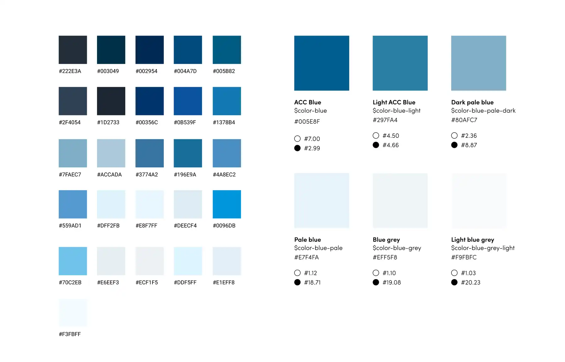
Consolidating 32 shades of blue
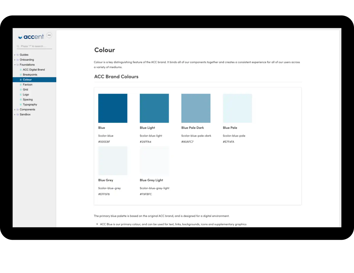
Our visual and experience designers worked closely together to determine the foundational elements for a component such as typography, spacing, and colours — including consolidating 32 different shades of blue!
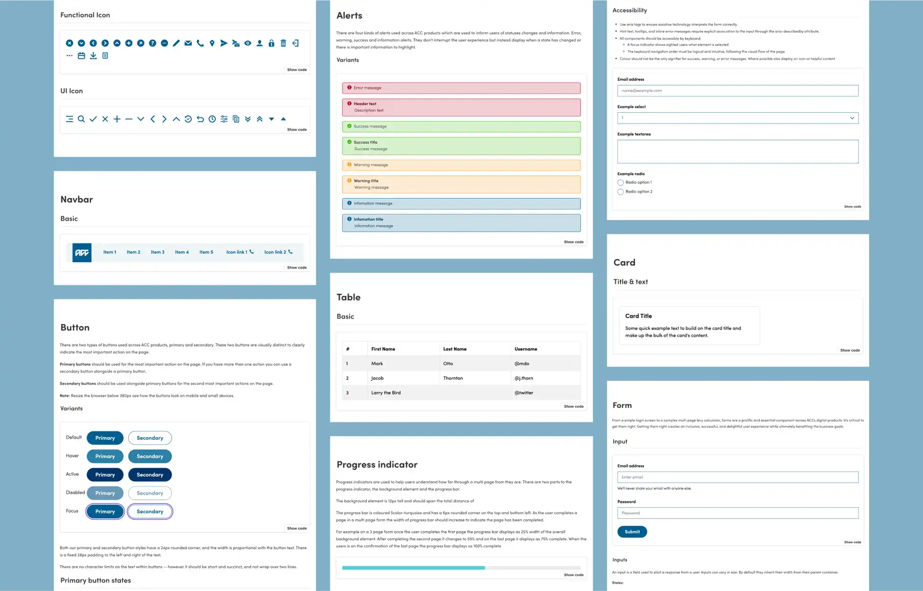
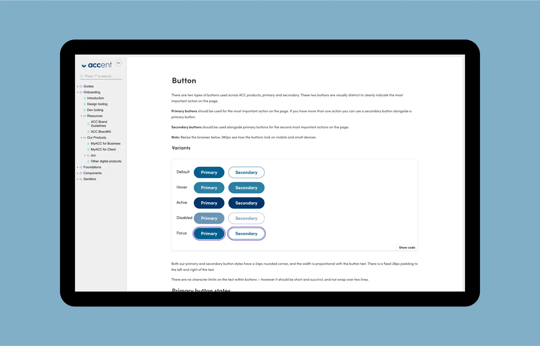
Using these elements we then created a series of components with uniform visual design, function, and UX, for use in a variety of contexts.

The outcome One library to rule them all
ACC now has one pattern library of components that they can easily roll out across all of their products, unifying their look and creating a consistent experience for customers.
We also provided a guide for them to create further components in the same style, as they need them.
Previous
Massey UniversityNext
Ministry for Primary Industries