The challenge Elevate the signature style, and do it impeccably
Klim wanted a refreshed website to elevate their signature style: elegant, professional, and contemporary. As a company whose foundational ethos is “a thing well made”, beautiful, bold design combined with a seamless experience and a modern feel was all-important.
Our approach A minimal and precise aesthetic
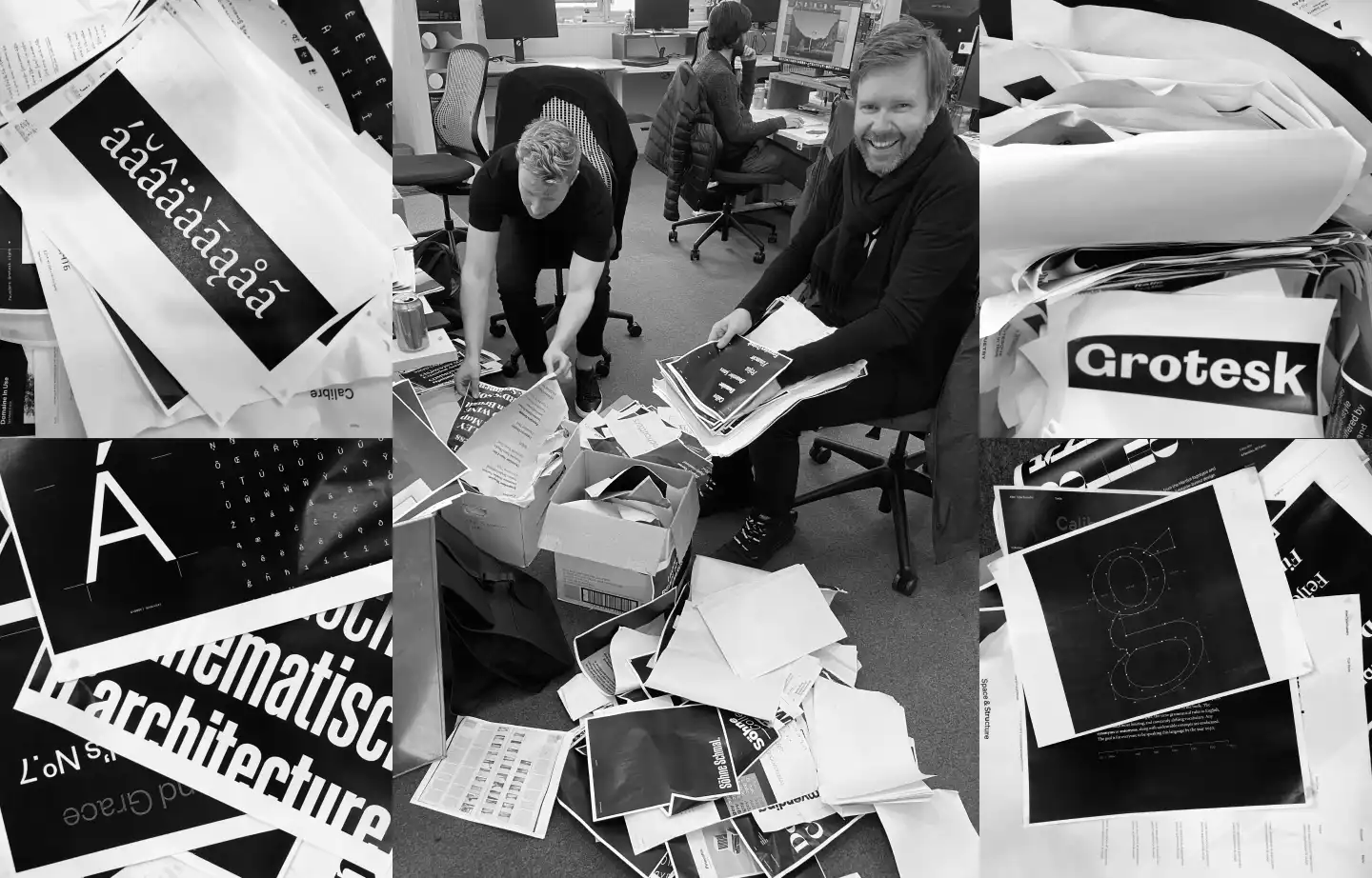
We were inspired by mid-century typography design. Historic type specimens were a strong reference for our mood boards. Swiss style characteristics are present throughout the final visual design: it’s minimal, bold, and clear.
We implemented a grid structure made possible with CSS grids. The grid structure better showcases the breadth of Klim’s work — from their typefaces to gallery exhibitions, to articles and design thinking.
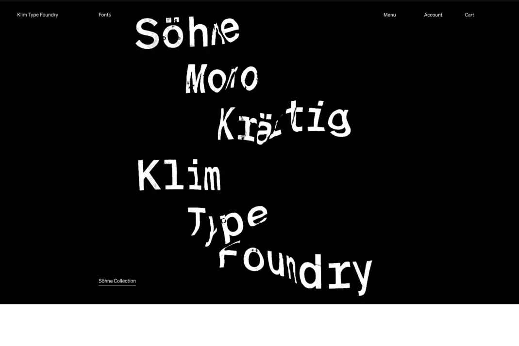
White on black for boldness and simplicity
We went with white type on black, referencing the dramatic, bold contrasts of the iconic designers who inspired us. White on black makes the letters stand out — like they’re glowing. Video animations created by DIA give movement to the letters and bring them to life.
Keeping it running fast
For a satisfying user experience, speed is essential. To keep the fonts and user interface running fast, we used Gatsby to generate a static site, with a GraphQL API loading data from our headless Wagtail CMS.
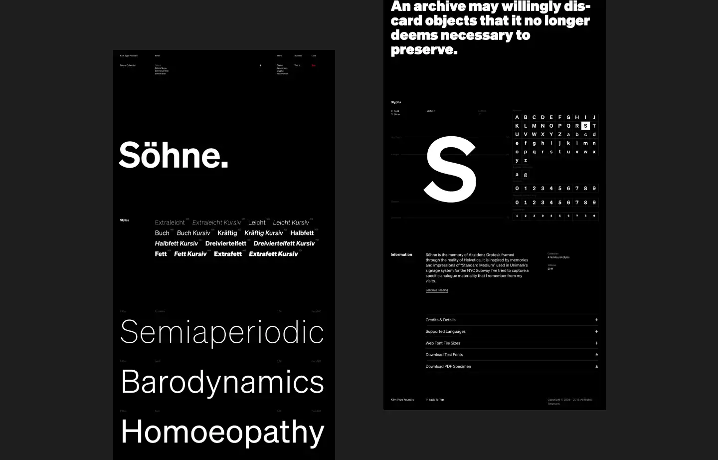
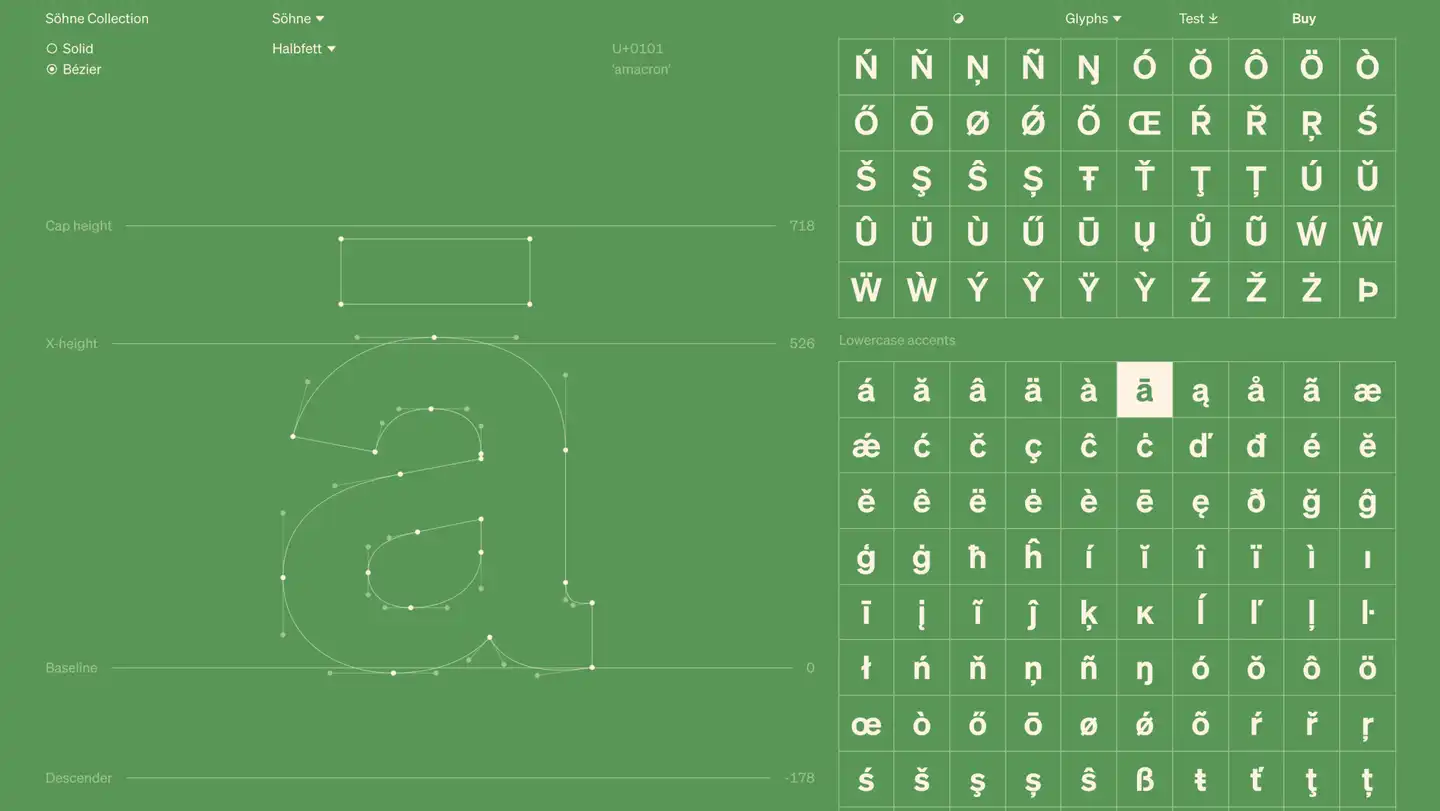
Colours and a grid to see the detail
It’s not all monochrome — we built colour themes on the type pages, and the ability to toggle on a grid. The colours and the grid help you imagine the typefaces in different contexts, and see the detail of them.
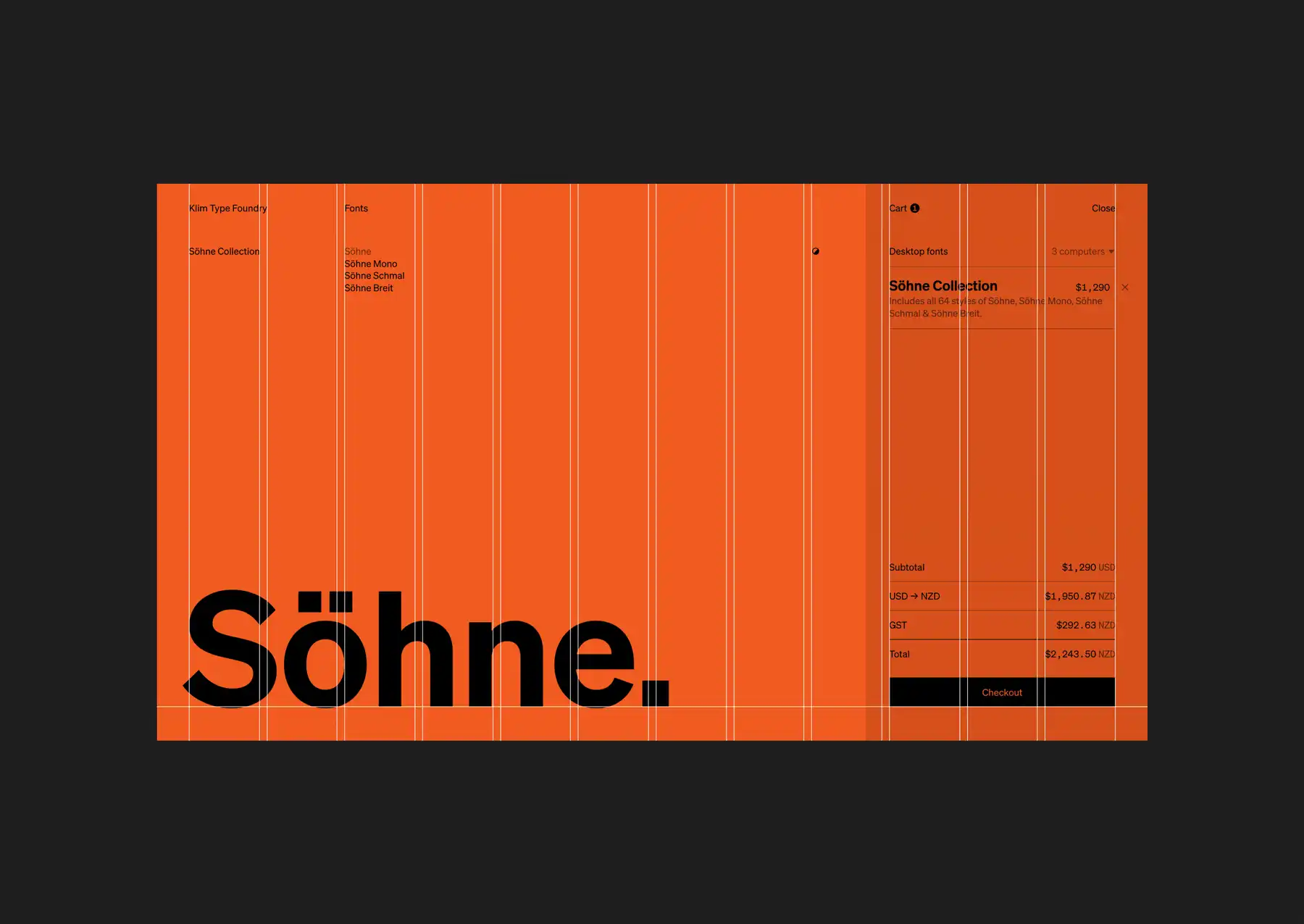
An easter egg to delight design geeks
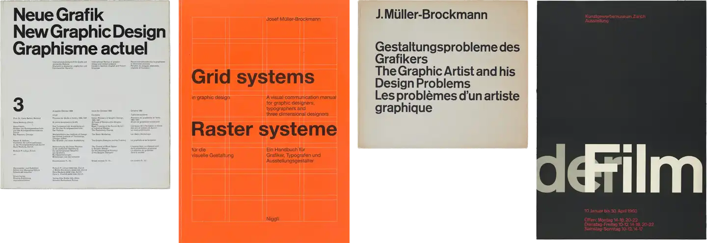
Klim released a new font collection, Söhne, at the same time as the new site. On the Söhne collection page, by changing the colour to orange and toggling on the grid, Müller-Brockmann’s iconic ‘Grid Systems in Graphic Design’ book cover can be recreated.
It's a nod back to the modernist graphic design of the mid-twentieth century that inspired the new font collection, and a hidden easter egg to delight designers.
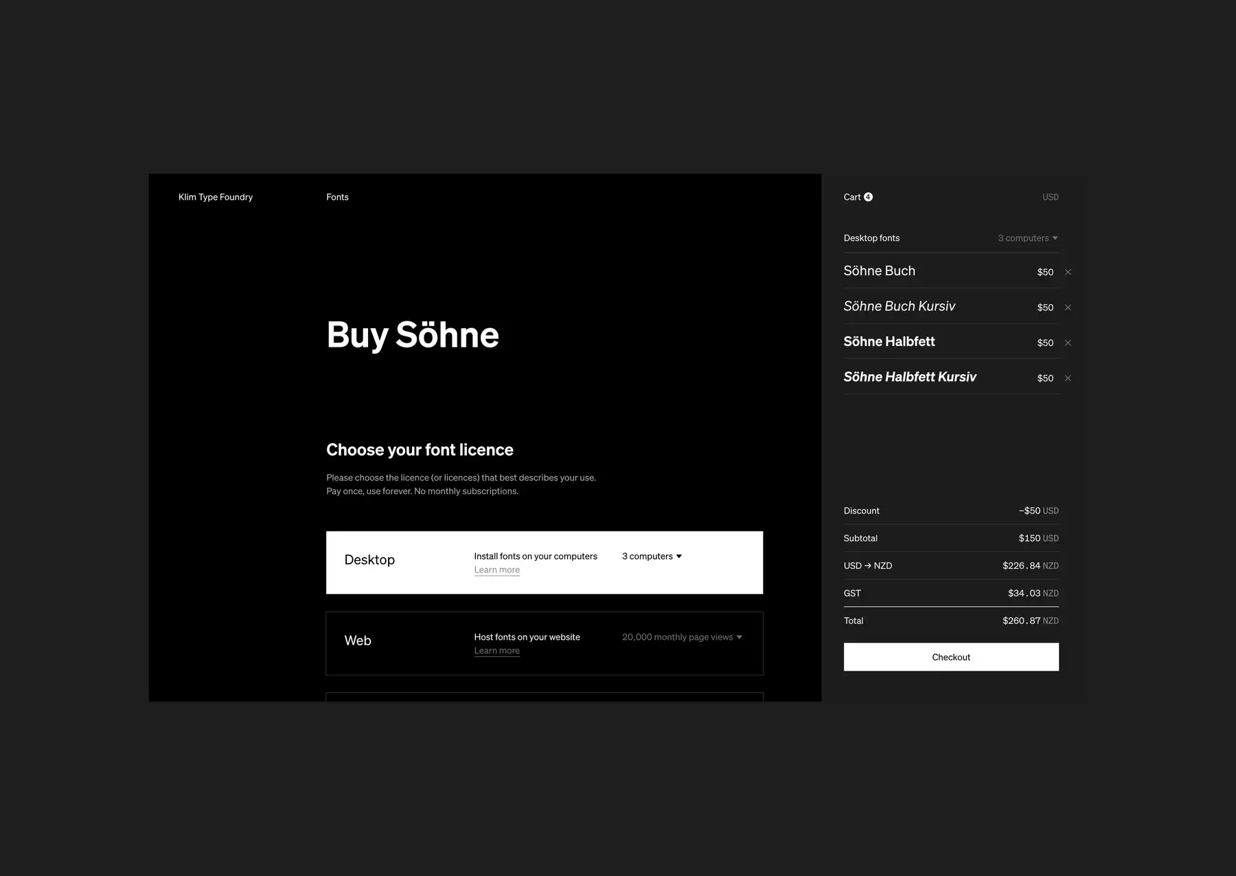
A custom-made ecommerce experience
Designers are the core user group of the site, but our research revealed developers, marketing and brand managers, procurement staff, and project managers were also frequenting the site to explore and buy fonts.
We interviewed a wide range of customers and redesigned the ecommerce set up with their needs in mind. It uses:
- Stripe for transactions
- Django for managing fonts and orders
- Wagtail for content management
- optimistic caching in the cart, to make everything instantaneous.
Try before you buy
Experimenting on-screen with new fonts is now easier. People can try OpenType features, change alignment, add columns, and adjust line-height and letter-spacing. Full character sets can be tested with the glyph inspector.
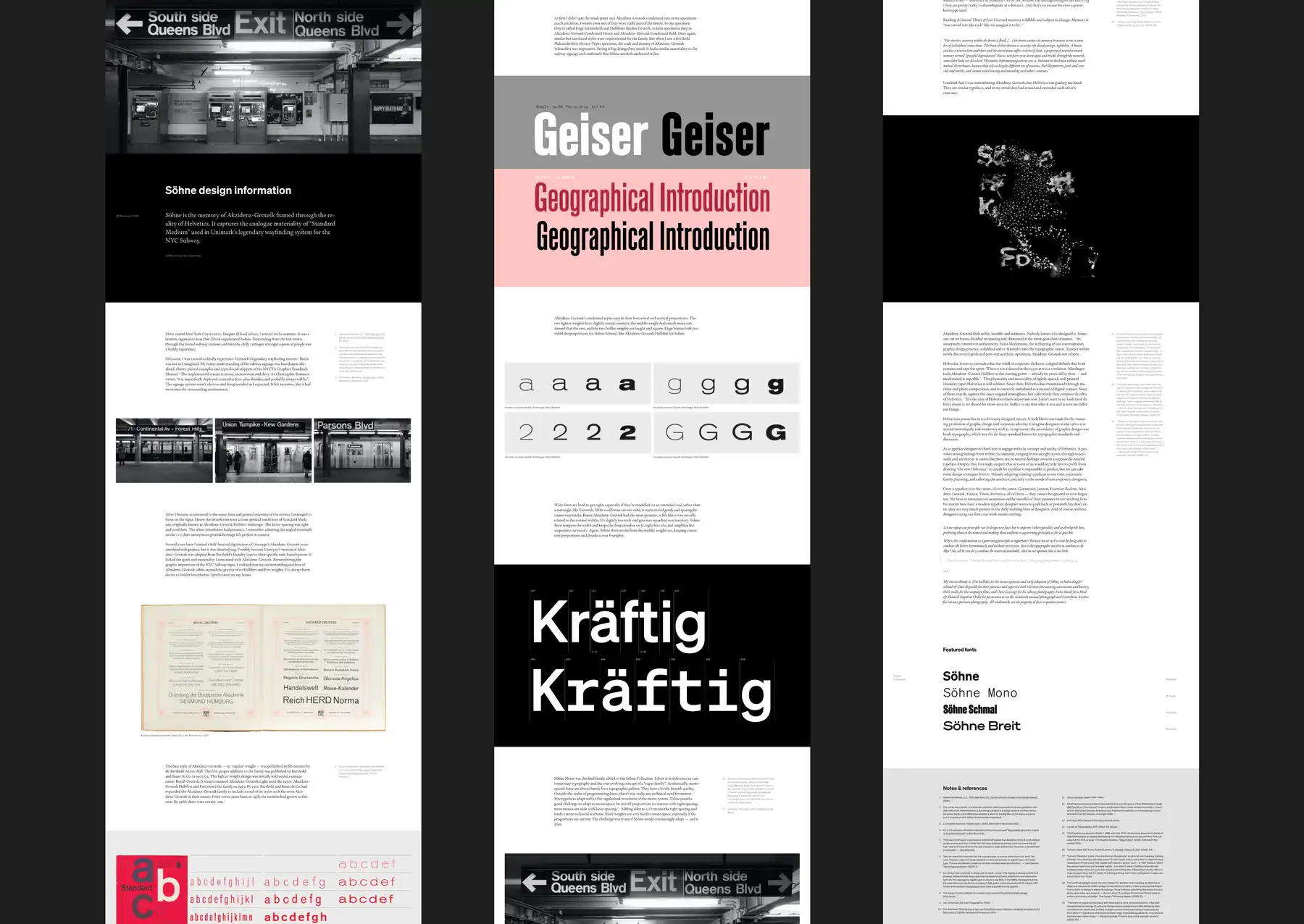
Crafting a new reading experience
People come to the site not only to buy fonts but also for design information, articles on typeface craft, interviews, essays and critiques.
We brought the blog to the homepage menu, and gave it the grid styling. It is now highly crafted and configurable. The title has a word-counting function — it calculates the total number of words in the entire blog, as more articles are added. It’s a fun, dynamic way to acknowledge the importance of words for Klim and their customers.
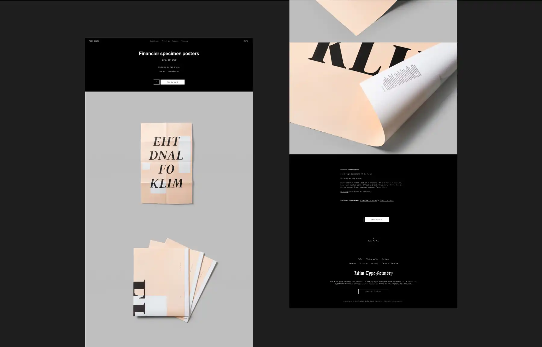
Customising Shopify for Klim Goods
Alongside the Klim site redesign, we also created Klim Goods, a new online store for t-shirts, posters, badges, and books. We wanted to use Shopify’s stock management and fulfillment systems, so we built a custom Shopify theme to fit the Klim style.
The results Creativity at the heart of a seamless experience
The new website encapsulates the elegance and function of Klim Type Foundry. It makes exploring and buying fonts a seamless, easy experience, and it encourages thoughtful design. It invites people to consider not only what they write, but also what the look of the letters themselves communicates.
The site is the clear culmination of in-depth research, technical knowledge, and masterful design.
Australia Graphics Design Association juror
Awards
The new site has been incredibly well-received, winning multiple awards and praise from around the world.
- Certificate of Typographic Excellence, Type Directors Club, 2020
- Red Dot Award, Best of the Best: Typography, 2020
- Red Dot Award, Best of the Best: Website, 2020
- AGDA Design Awards: Pinnacle & Judge’s Choice, Website, 2020
- AGDA Design Awards: Distinction, Design Craft, Typography, 2020
- AGDA Design Awards: Distinction, UX, Interface & Navigation, 2020
- AGDA Design Awards: Distinction, Digital & Mobile, 2020
- DINZ Best Awards: Gold, Large Scale Websites, 2020
- DINZ Best Awards: Silver, User Experience, 2020
- DINZ Best Awards: Silver, Digital Products, 2020
- DINZ Best Awards: Bronze, Digital Campaigns, 2020
- Communication Arts winner: Typography Annual, 2020
- D&AD shortlist: Digital Design, Digital Products, 2020
- Webby Awards nominee: Best Visual Design, 2020