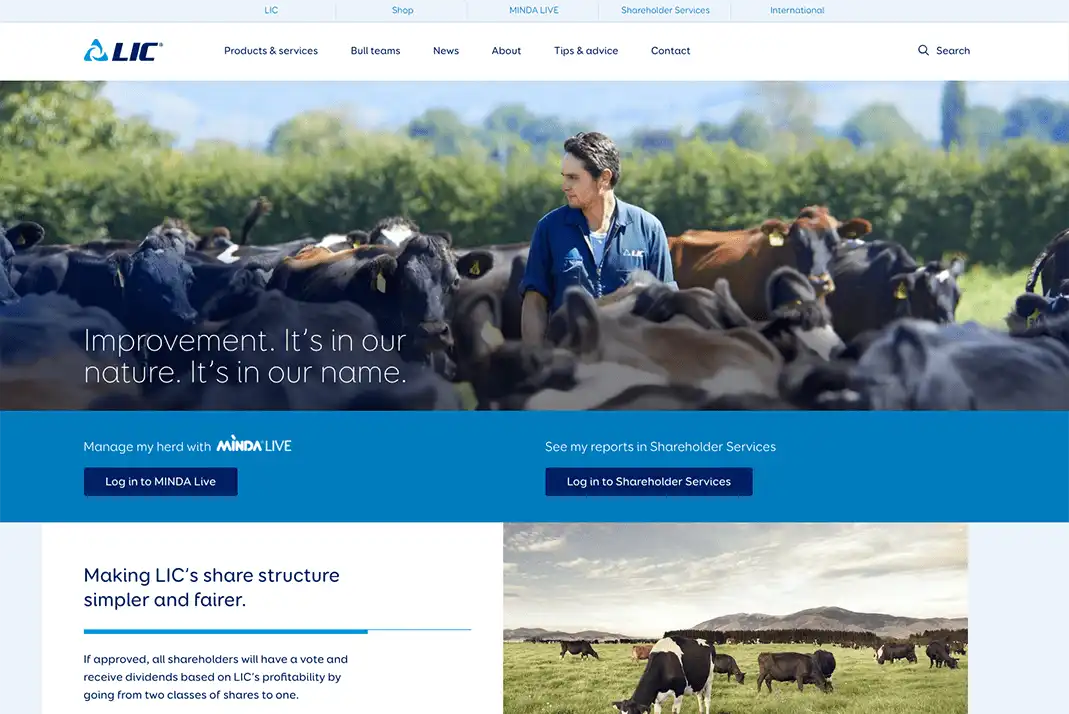
The Challenge Giving back farmers their time
Farmers are particularly time-poor. To help free up some of their time, LIC wanted to enable farmers to self-serve online. This would also allow call centre staff to support customers with more complex queries.
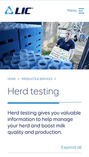
So, we needed to give farmers the information they wanted quickly but take into account accessibility, including locations where there is limited internet connection. Reducing staff time maintaining outdated, hard-to-use platforms and systems was also a priority.


of
Our bounce rate has dropped by almost half. It’s sitting in the low 30s compared to high 50s/60s on the old site!
Digital Channel Manager, LIC
Our approach Putting customers and content first
Our in-depth discovery period began with stakeholder workshops to absorb LIC’s deep knowledge of their customers. This led to the development of lean personas, which were fleshed out through research and interviews with farmers.
Designs were continuously iterated to improve the UX and user interaction. These were tested with farmers and stakeholders to make sure customers found the website usable and beautiful.
Curing the content headache
Using the customer research, analytics and conducting further interviews we developed several new and improved versions of the Information Architecture (IA). Working closely with LIC’s subject matter experts we rewrote the entire website, transforming complex scientific content into plain English.
Design and content – playing nicely together
We carried out several rounds of moderated in-person testing with farmers to make sure the design and IA worked together to support key user journeys through the website. With LIC’s product owner we developed a content model that made sure the visual design worked for all content types.
Our new CMS is much easier to use – very intuitive. We love the design of the new site and it is extremely easy to navigate.
Digital Channel Manager, LIC
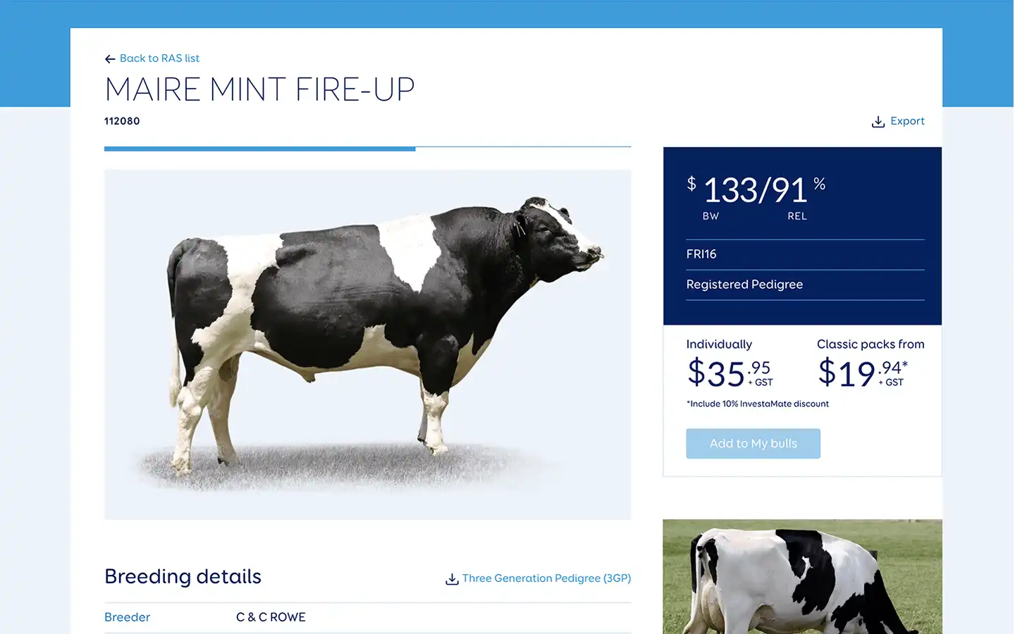
Simplifying bull selection
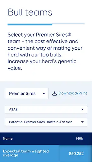
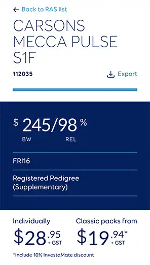
The Bull teams tool allows farmers to select a particular bull to mate with their cows, according to the specific traits the farmer requires. The previous version often ended in a farmer calling LIC for advice.
We used React to create a beautifully crafted interactive tool that pulls in a mountain of data through a purpose built API. Using our technical expertise and an open source plugin, we were able to ensure it works across browsers and device sizes.
Now farmers can choose the bulls and traits they need quickly and easily online through one simple, elegant interface.
The results Delivering a delightful digital experience
Our robust processes, ongoing UX, design approach, and content strategy are providing LIC customers with a much more delightful digital experience. Content is now much easier to find, easy-to-read and accessible in parts of New Zealand where reception is traditionally poor. And staff are understandably proud.
37%
increase in session duration
10.5%
increase in users
37%
decrease in bounce rate