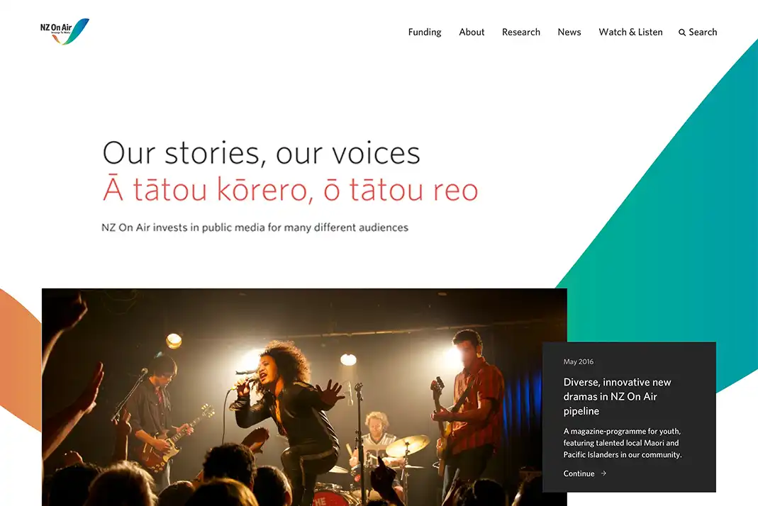
The Challenge Simplifying access to funding and information
In 2018, NZ On Air asked us to help improve the way people access information on their website. They wanted to reduce the number of people going directly to their comms team for information by having a clear and useful website.
NZ On Air needed a new approach to navigation to make it easier for their two key stakeholders:
- Content creators seeking information about, and applying for, funding.
- Public and news media seeking funding results.
Loved the design ideas, and the way the design team expressed these. Their enthusiasm was infectious.
NZ On Air
Our Approach Understanding the funding seeker journey
NZ On Air knew people weren’t finding what they needed. A dive into website analytics and a walkthrough of key user journeys confirmed this. But we needed to gain a better understanding of who their users were and what they needed.
Following discovery workshops, analysis, and content modelling, we quickly prototyped wireframes to test the information hierarchy with real content. Some interesting differences between user types were revealed.
First time and old hat funding seekers
Some people were applying for funding for the first time and wanted to understand the application process in-depth. Others were veteran users who applied regularly – they only wanted information about the next deadline, or to go straight to the application page.
We needed to make it easy for everyone no matter their different needs, whilst maintaining a consistent look and feel across all user journeys.
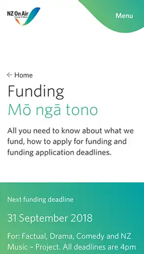



of
Removing barriers to funding
Applying for funding needed to be a simple process. Deadlines and funding criteria also needed to be clear. This required revising the website’s information architecture (IA).
Centralising funding information
Previously, the website’s top-level navigation was split into three funding sections — scripted and factual funding, music funding, and platform funding. With most funding sections containing similar or identical content, it was often confusing and difficult to navigate.
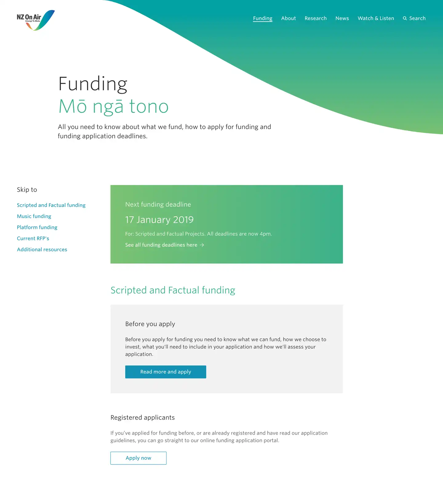
We centralised the funding information by creating a single page in the top navigation. This creates a more logical flow for applicants. First time applicants could go to the funding section and from there discover which type of funding they needed.
Skip to what’s relevant
We created a sidebar navigation so people could quickly skip to the section they were interested in. This feature brought more order to the process, and allowed people to easily and quickly find the information they need.
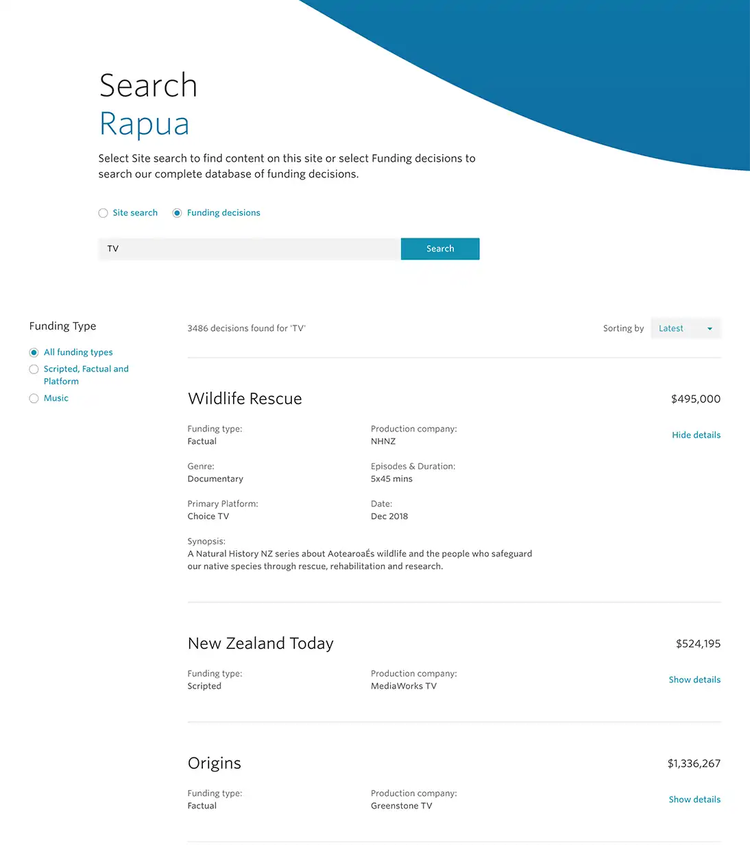
Simplifying the search
Previously, searches were a complicated and arduous task, requiring people to fill out a number of filters. We enhanced navigation of the site by stripping back and simplifying the search function.
We kept one toggle option: to search either site content or funding decisions. Providing a reliable, user-friendly search function has made it simple for people to find the information they need.
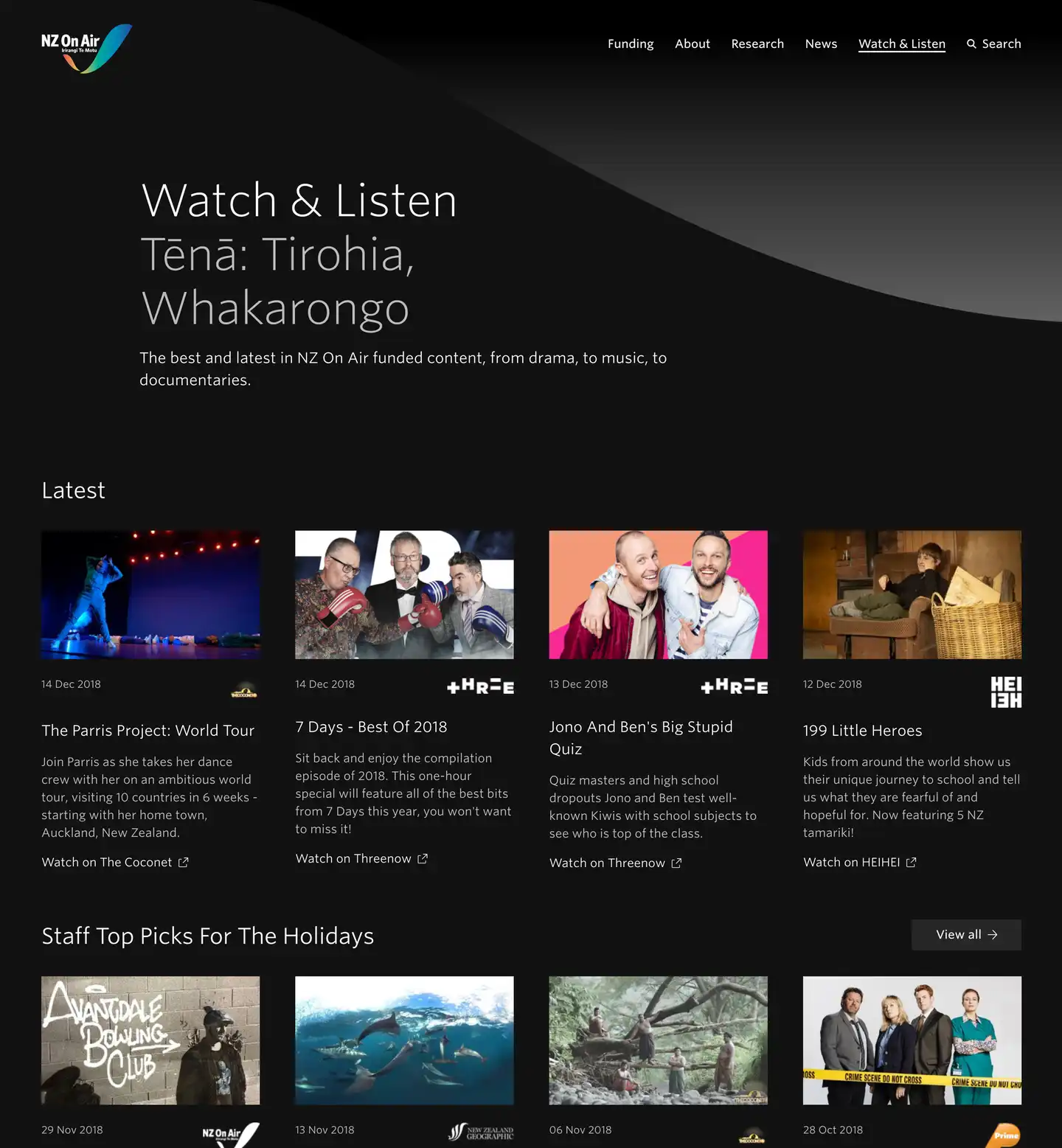
Watch & Listen...to your favourite NZ content
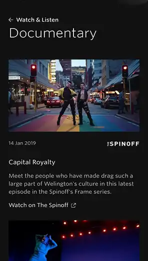
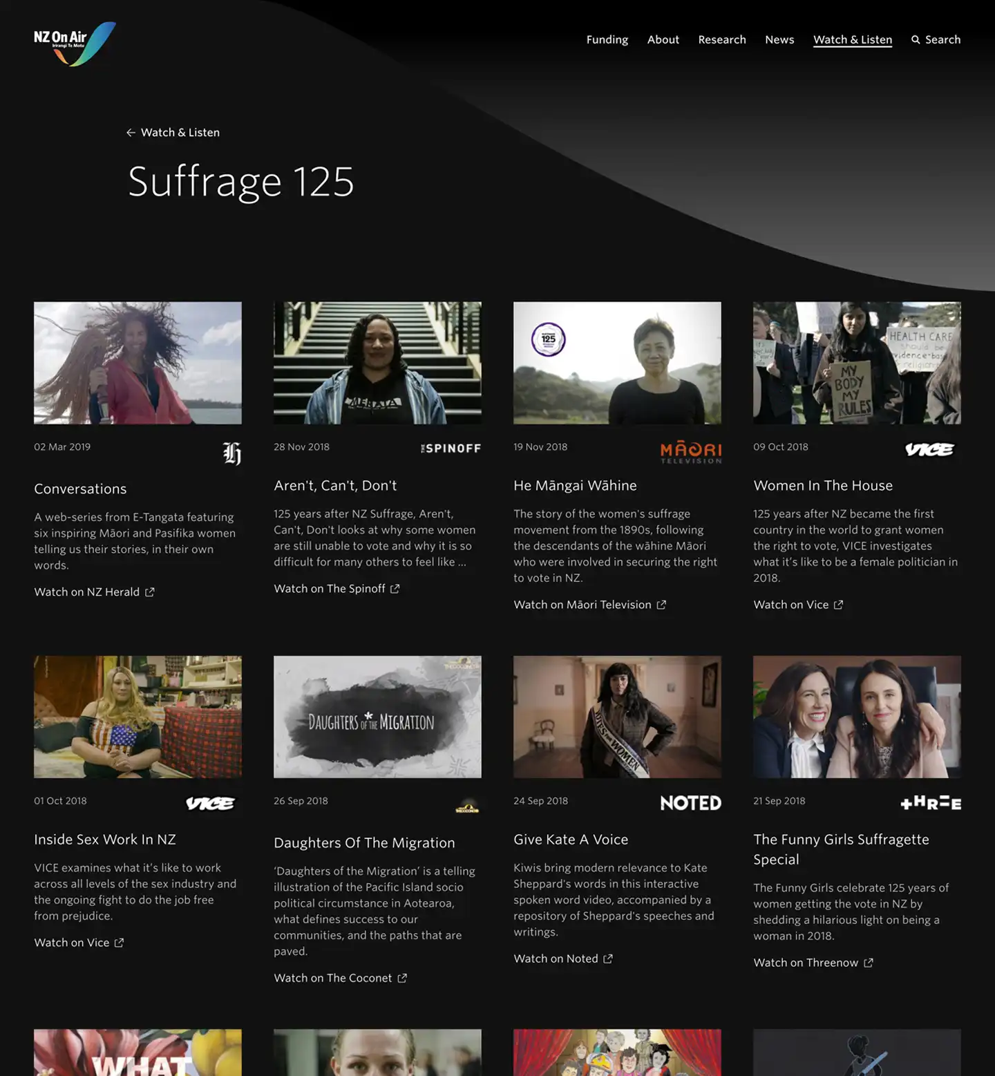
NZ On Air wanted a section on their website that would showcase what they’ve funded. Enter the Watch & Listen section: a dedicated area on the website that serves as a portfolio of New Zealand-made content, from drama to documentaries, children’s content and music.


of
The Results A clear path to the right information
Creatives can find the funding they need
By reworking the IA and search experience, we improved how people navigate the site. People seeking funding now have a much easier path to finding key dates, funding criteria, and application submissions.
Research and discovery made easy
People are now equipped with a search tool that gives them immediate information on funding decisions. So far, they’ve made over 15,000 unique searches.
Customer feedback has been overwhelmingly positive.
NZ On Air