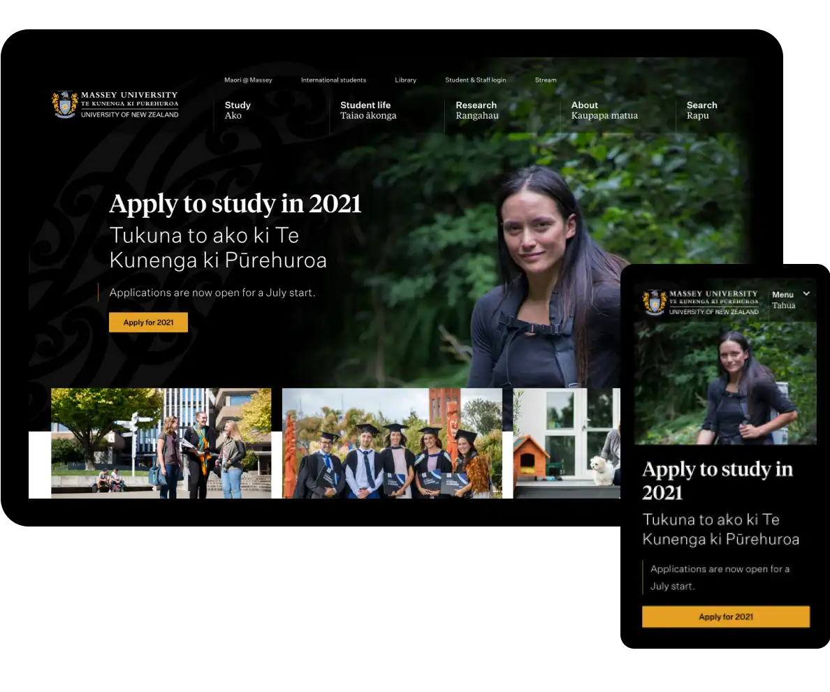
What we’re proud of
Developed and followed product principles to reflect Massey’s Te Tiriti goals
Reduced the number of content pages by half, through a new information architecture and full copy rewrite
Created meaningful bilingual content in English and te reo Māori, and collaborated with Ariki Creative on toi Māori visual designs
Reduced management overheads and enhanced user experience, due to custom integrations with Massey’s internal systems
A site that loads incredibly fast, due to our component-driven approach
Made the site modern, easy-to-use, and significantly more accessible and inclusive
The challenge Make education more accessible
Massey University is a big university with three campuses across New Zealand, and 12,000 students studying by distance online. People from all over the world, at different life stages, consider studying at Massey — and the website is their go-to place to learn about what the university has to offer. Over 3,000,000 students and staff use it each year.
The previous website didn’t reflect Massey’s Te Tiriti-led approach or feel welcoming to potential students. It was difficult to use and intimidating for people considering university. We redesigned, rewrote and redeveloped the site, radically simplifying it to make it easy to navigate and accessible to more people.
How we did it Te Tiriti-led approach
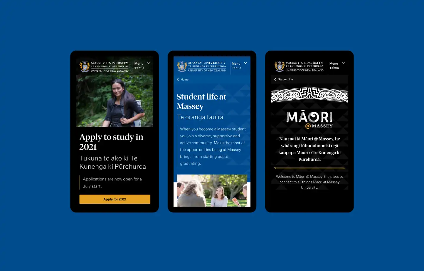
The team from Massey’s Māori Office created He Kaupapa Tuku Iho, guiding principles for Massey, which we wove into website product principles to guide all content, design, and development. We worked towards “meaningful visibility of Māori students and Māori staff”, prioritisation of equity for Māori, and “a culturally-affirming welcome for all students.”
Our principles enabled us to support Massey’s goal to be Te Tiriti-led — defining how we could welcome people to the website with manaakitanga and use te reo Māori with purpose and meaning.
Take pride. Be upfront about the strengths, values, and qualities that make Massey unique. Don’t be afraid to show visitors how we’re different from other universities. Showcase Massey's mātauranga, Māori knowledge, successes of our staff, students, and alumni.
Massey website replacement project
Understanding users
The journey to making decisions about study isn’t linear — although there are core pieces of information needed by all users, so much information is specific to location, age, and life circumstance. This meant we had to tailor the website to provide various types of information for different audiences in a clear and welcoming way.
A new information architecture
We made a new information architecture (IA), the backbone of such a large site. It was developed through quantitative and qualitative research with over 700 participants. The new IA radically reduced the amount of content and number of pages, and made the site intuitive to navigate.
Working with complex data
More than a set of static information pages, at the core of Massey’s website is a system of structured content for qualifications and study options. We worked with Massey’s internal teams to communicate what we needed from an API (Application Programming Interface) for curriculum information hosted in a series of databases — and seamlessly brought data and content from that API into the website’s user interface. Together, we solved complexity around inconsistent data entry and delivery.
OOUX for interface design
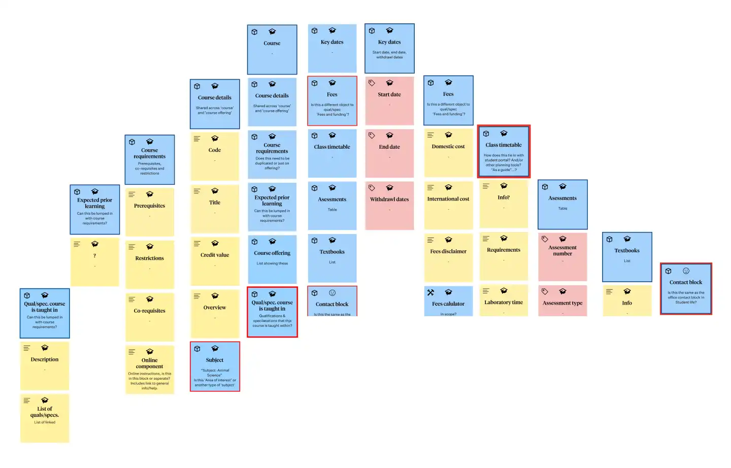
To translate the structure of Massey’s qualification and study information into elegant user experiences, we made a huge OOUX (object-oriented user experience) model. We broke the university down into identifiable, discrete pieces the user understands — for example course, college, campus.
The OOUX model helped us understand the relationship between different elements. It meant the content, structure, design and development of key study pages were oriented around the people using the website and their approach to finding study information.
A full content rewrite
We managed a team of 11 content designers from Springload and Massey, who rewrote all of the static content on the site. The content team worked remotely across Aotearoa, so we used collaboration tools Miro and Jira, and GatherContent for writing.
In-depth SEO reports helped us understand what users were searching for, and the pathways users were taking to find what they wanted, so we could craft content that was findable and useful.
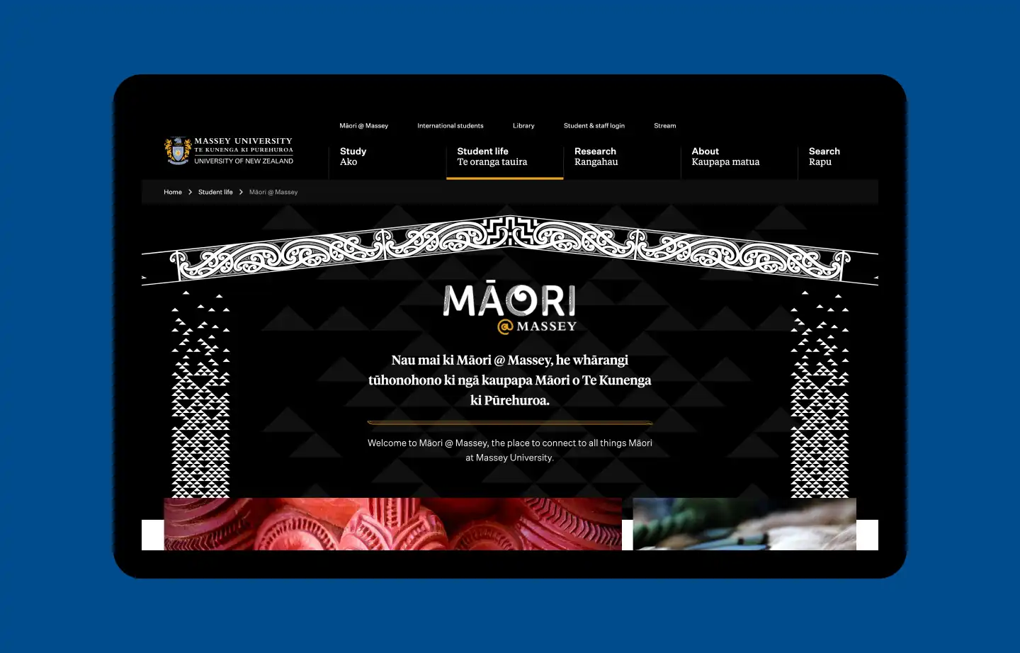
We also developed the Māori @ Massey section of the website to prioritise te reo Māori and a te ao Māori perspective, creating a bilingual section of the site wherever there was te reo Māori content available.
Developing the search function
We developed the search function for both structured and unstructured content, as well as for search suggestions, filters, and various types of searches.
This involved reviewing different search providers to determine:
- the feature set best suited to Massey’s overall use case
- the scalability of the solution
- the quality of the search results and ability to tune them
- the ongoing maintenance effort required.
We then implemented a search solution based on Swiftype (managed ElasticSearch), and configured it to provide a high-quality combined search to meet users’ needs.
An inclusive look and feel
Our visual designers created a new and inclusive look and feel. The Massey brand was predominantly blue, so we brought in more colour, including blacks and golds.
We proposed a new pairing of typefaces by Klim Type Foundry to begin a process of evolving Massey's brand to suit their new modern look. Massey are delighted with this fresh new direction, and the website redesign has since been rolled out on other Massey projects, including their Virtual Open Days and print brochures.
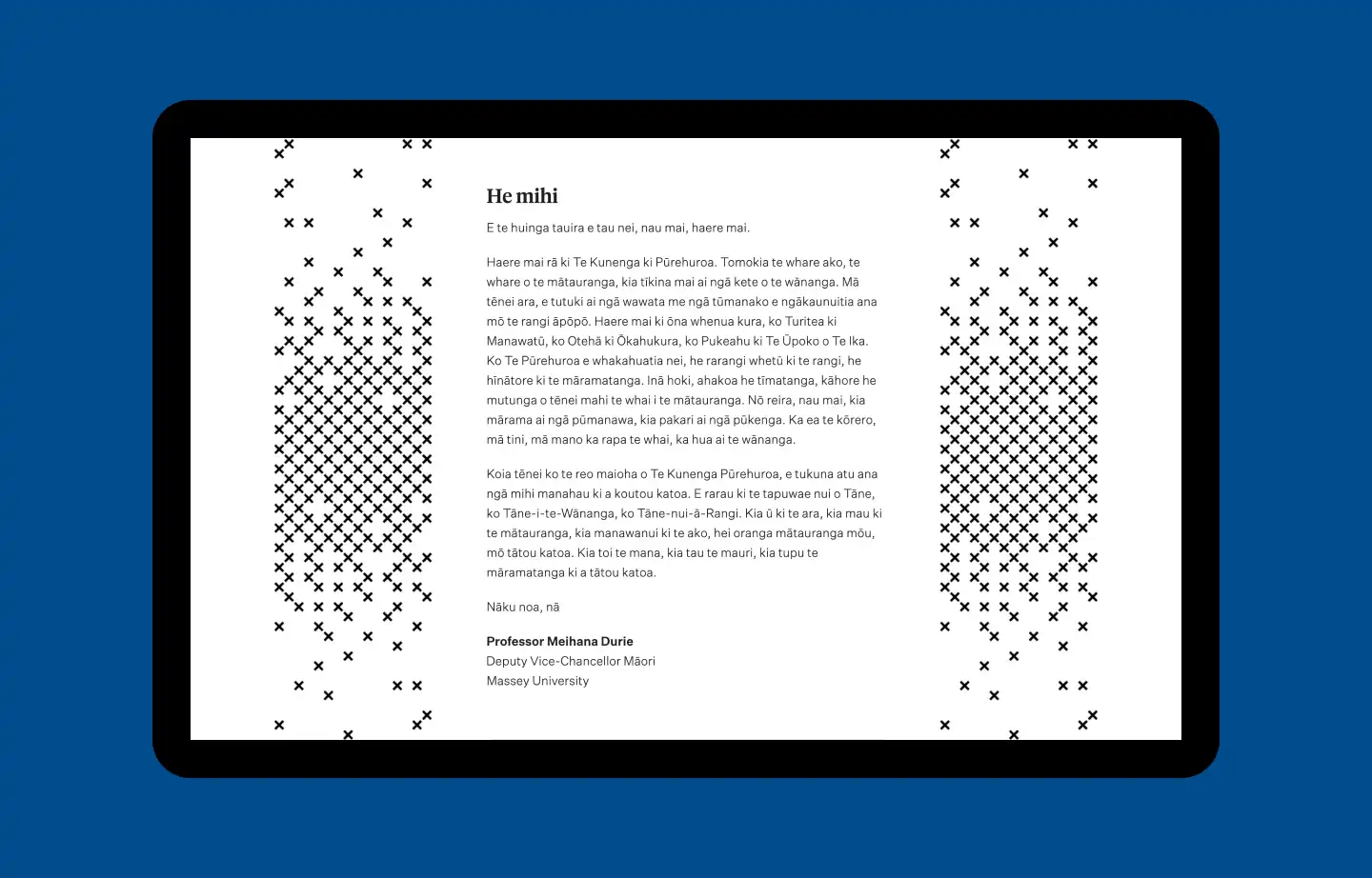
At the time we designed the site, we didn’t have our own in-house te ao Māori designers. We worked with Ariki Creative, who designed toi Māori visual assets, including a waharoa to welcome visitors into the website. The maihi at the top represents welcoming arms and hands.
Ariki Creative updated their kōwhaiwhai design (made in 2018 for Massey) for the web. The kōwhaiwhai pattern deliberately has some of the pattern missing, signifying Massey’s ongoing journey and the growth of their whakapapa.
Modular components, loading only what’s needed
We developed standard components, such as tables, image galleries, static images, alert banners, through to much more complex, interactive components like news and event feeds.
One of the core principles for the architecture of the site was performance, and we’re delighted at how lean and fast the site is now. With both current and prospective students likely to browse many pages, keeping load times to a minimum has a huge impact on user experience.
One of the ways we achieved this was by leveraging the modular aspect of the Wagtail CMS. All components are modular with all HTML and Javascript self-contained, so they don’t rely on other components to work. The browser only downloads the code that’s relevant to the page the user is on, keeping the site running fast and light.
Making the site more accessible
Previously, the Massey website had a large number and variety of forms for different needs. We integrated Formstack to make all the forms the same in style and function. Formstack also allowed us to re-style the forms to make them more accessible.
We also implemented accessible colours and styles across the design, replaced components that were not keyboard accessible, and fixed ‘focus traps’ — where users get stuck somewhere with no way out.
We made bilingual content accessible by marking up all te reo Māori text with specific HTML code to enable screen readers to pronounce words correctly. We ensured a pleasant screen reader experience by making sure they take a pause when reading text containing different languages, such as dual-language titles or navigation links. Separating the languages on different lines also helps Google Translate to translate more effectively.
The website is now much easier for people to use, and better reflects Massey’s goals of a warm, welcoming introduction to university and making education more accessible.
The website looks 1000% better, and feels up to date! Thanks so much and congratulations on the upgrade!
Student Advocate, Massey Wellington Students Association
It was such an exciting day, after nearly two years! We have already received some really favourable comments on how good the website looks. It’s been such a pleasure working with the entire Springload team, everyone is always so patient and positive while we navigated some of the Massey processes.
Project Manager
It was all a bit surreal coming back from leave and launching all in the same week! I can’t thank you all enough for the last six weeks of grind to get to the finish line, and of course the past 12+ months of amazing work to get us to this point. It’s been an absolute pleasure and I’m so stoked that we get to keep working with you guys too!
Product Owner
Previous
HealthEdNext
Again Again