
THE CHALLENGE Make content and design friendly, clear, and useful
MTF Finance offers a local, personalised service. Using human-centred design, we redesigned and rebuilt their website, completing a full content overhaul to make it useful and easy to use.
OUR APPROACH Put customers’ needs first
Our content and UX designers visited local MTF Finance offices, spent time talking with staff, and interviewed intended customers to learn what they needed from the website. Armed with detailed first-hand feedback, we:
- mapped customer journeys and identified UX issues
- assessed SEO performance and optimised content to boost search engine ranking
- redefined the information architecture, re-grouping information to clean up confusing customer journeys and make finding information intuitive and easy
- rewrote key pages to provide examples of customer-focused content design.

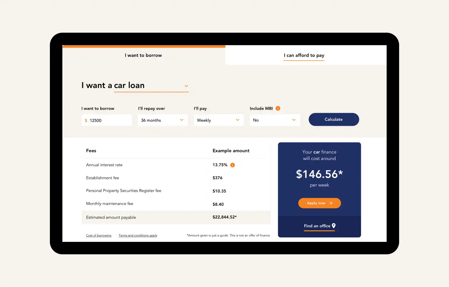
An accessible loan calculator
Based on earlier insights we knew that many people arrive at the site with the question: can I get a loan? We built a loan calculator and put it on the front page. It’s easy to use and understand, even for people new to finance, and can scale up and down for different devices.
Conversion tracking on the backend lets MTF Finance see where their leads are coming from, so they can know where to focus their sales and marketing efforts.
Adapting the print brand for digital
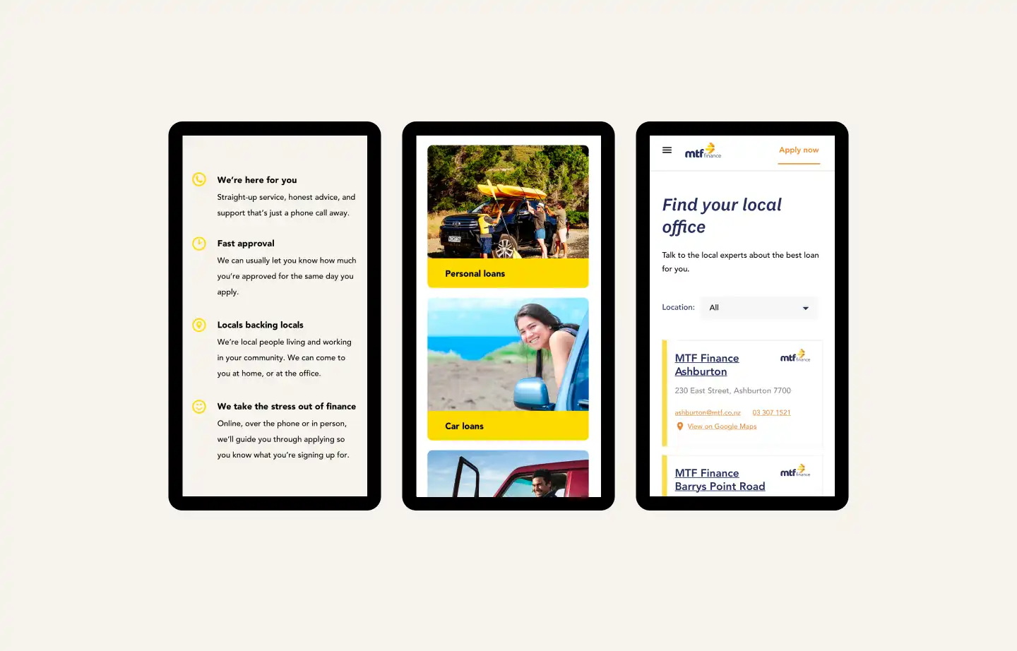
MTF Finances’s signature colour is a bright yellow — their yellow advertising and buildings stand out across the country. But online it can be overpowering. Our visual designer developed a design style that uses yellow only in key places. This keeps the brand colour present, while making sure it doesn’t dominate the digital experience.
Connecting people to their local lending expert
People often want to talk to someone about their situation in person. We built interactive maps to make offices and dealerships easy to find. We integrated MTF Finance’s locations database into the backend, so contact detail changes flow through to the maps automatically, keeping them up-to-date.
Structuring content with Wagtail's streamfields
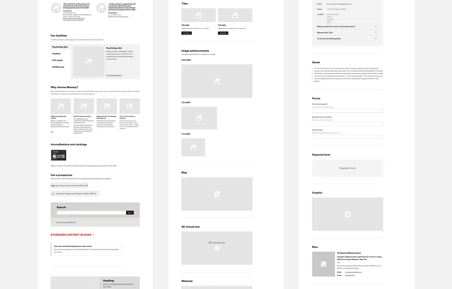
MTF Finance didn’t have a content management system so we implemented Wagtail, and used Wagtail’s streamfields to structure content. Streamfields provide a lot of options for how to layout a page without compromising on design. MTF Finance’s content editors can move content around as they like, and it always fits the design aesthetic.
A blog to instil trust and keep the site feeling fresh
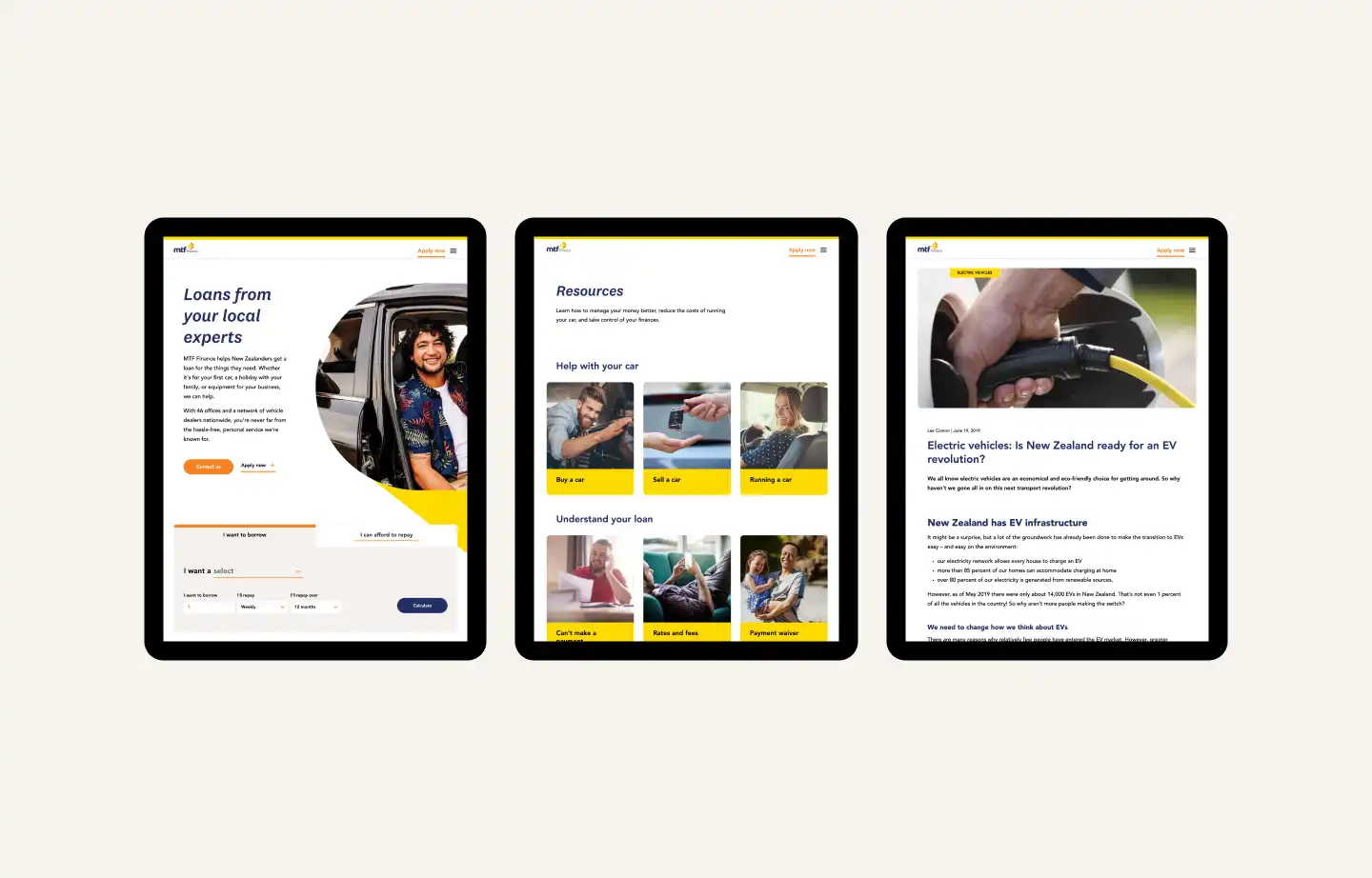
We added a blog so MTF Finance could share their finance knowledge. The blog brings a sense of trust and expertise to the website, and the continuously refreshed content increases search engine rankings.
The results A stress-free experience that helps rather than hinders
With its new friendly content, colourful yet calming design, and clear IA and customer journey flows, the MTF Finance website is now a stress-free experience that leads people to what they need.
Six months after launching the new site, Google Analytics showed a 73% increase in new users, showing the website was reaching customers and those in need.
73%
increase in new users
Previous
Accuro Health InsuranceNext
Department of Internal Affairs