The challenge Overhauling the New Zealand Red Cross website
New Zealand Red Cross felt their website was long overdue for a visual and technical overhaul. They wanted a fresh, modern site that blended visual simplicity with an easiness on they eye. It needed to be more emotive, engaging and better present their work and programmes.
They wanted to change how their content was grouped – reduce the number of clicks, delete replicated pages – and improve how people move around the website. The main priorities were making it easier for people to donate, book first aid or get involved with volunteering.
We are incredibly happy with the new website, it has delivered everything we wanted and feedback is positive.
General Manager – Communications and Fundraising, NZ Red Cross
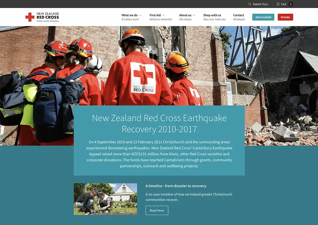
Our approach Driving donations to where they're needed most
We let people donate from every page by adding a button in the top level navigation. Providing default amounts for donations increased the average amount by 90 percent.
Relevant examples of how the money could be used helped to connect the donation with the campaign and increased trust. People often like to donate after viewing events on the nightly news – a responsive website makes this 'spur of the moment' activity easier.
Simplifying course bookings
Most people that book a first aid course opt for one of a few key options. A new course finder uses smart defaults wherever possible to provide 90 percent of visitors immediately with useful info without having to request too many details.
People also attach a location keyword like “first aid course [Wellington]” when they search for courses externally. Structuring the results listings to be sympathetic to this immediately boosted over New Zealand Red Cross’ major rival.
Withstanding traffic spikes
To handle huge spikes in traffic we serve the site over a globally load balanced, fully redundant, content delivery network (CDN). The CDN takes pressure off our servers and ensures stability in the event of a national or international emergency.
We also provided the site with the capability to switch into ‘emergency mode’. A stripped-back homepage lets visitors have access to critical emergency information even when internet access gets patchy.
We wanted an agency who would challenge our thinking about the web and produce the best experience for our donors, supporters, and first aid clients. Springload has met these requirements and then some.
Online Community Manager, NZ Red Cross
The results Increasing visits without search
Since the website was redesigned we've increased the amount of visits without using the site search by 4 percent. This shows we've made it easier for users to find the content they need without using the search function.
4%
increase in page visits
Previous
RNZNext
New Zealand Festival