For growing organisations, first websites are like a first pair of shoes — the right fit when you get them, but you outgrow them, and need new ones to get where you want to go.
The challenge A refreshed, fit-for-purpose website
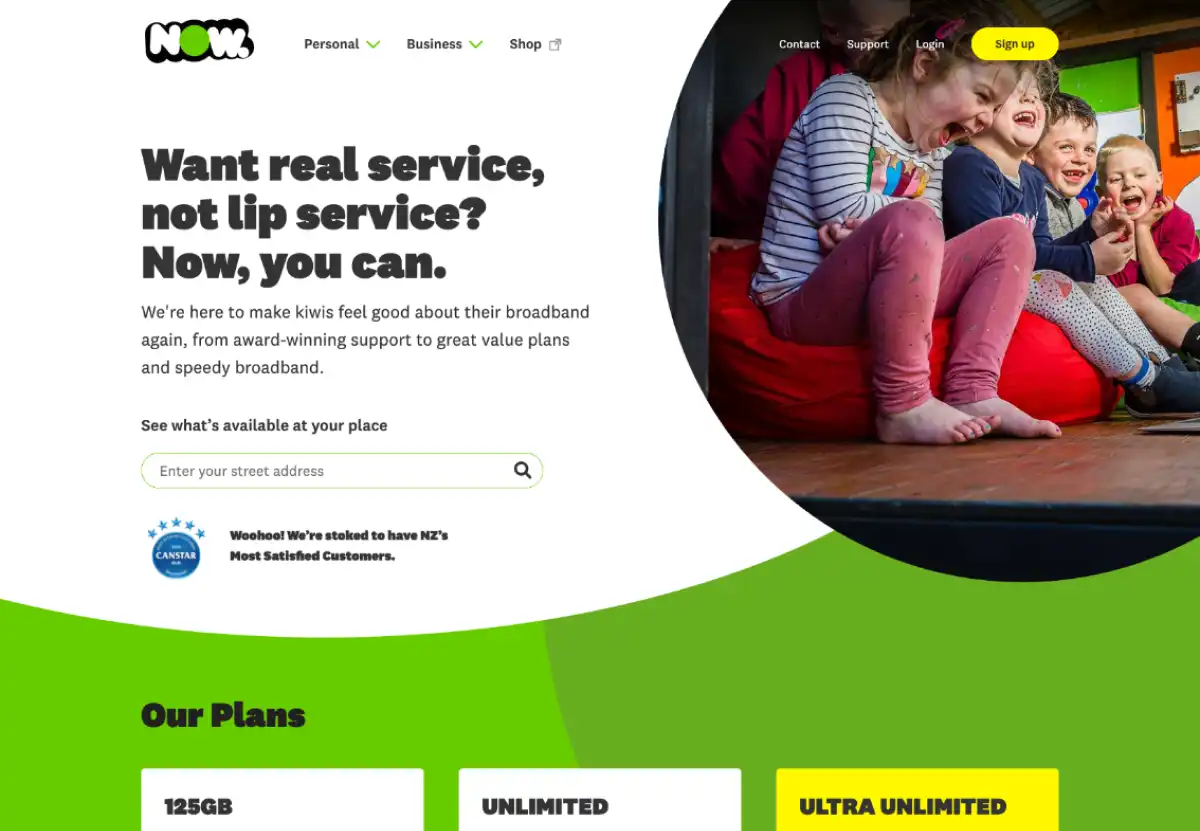
NOW is a small telco company that has experienced rapid growth over the past few years. They had outgrown their old website. New and changing plans and products meant customers were getting confused during the signup process, dropping off and going to different providers instead. NOW needed their website to be simpler and customer-focused.
They also wanted to update and digitise their brand. We refreshed their look with a new, flexible brand system and incorporated it into the new site.
By presenting customisable phone and broadband plans simply, we more than doubled their monthly signups.
Our approach Finding the pain points with user testing and wireframes
To improve the user experience and signup flow, we needed to figure out where and why customers were dropping off. We ran two rounds of user testing sessions with different demographics to find the pain points. We built and tested wireframes with the customer service team, as they are the experts on the signup flow, using it every day to sign up customers over the phone.
We discovered that customers weren’t getting enough of the right information at the right time throughout the signup process. Customers wanted to view, compare and customise plans easily, without being overloaded with other information they didn’t need.
The right information in the right place, at the right time
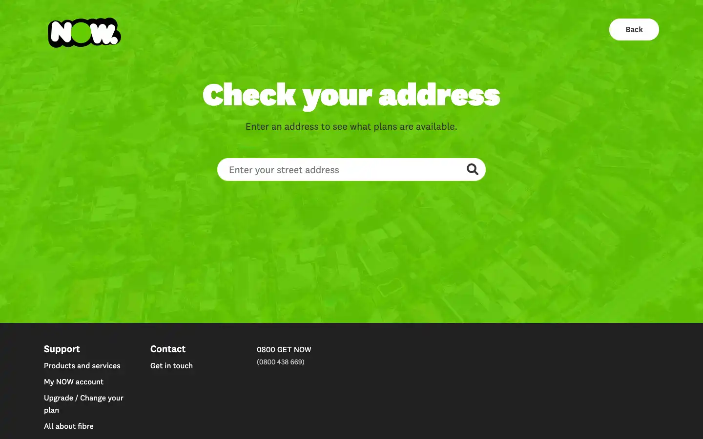
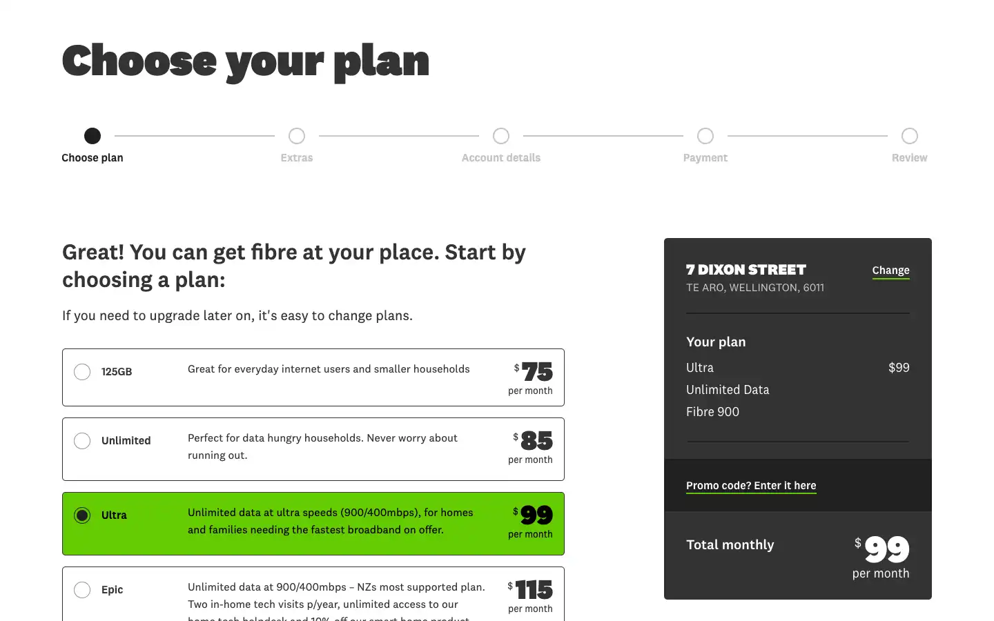
We simplified the signup process without removing key information. Our approach was to feature NOW’s three base plans in relevant places. Customers can now compare plans and make their decision before entering the signup flow. Customers can also get recommendations about the best plan for them.
A clear and transparent signup flow
Customers now have a full view of what they’ve chosen, a running total of the price, how far they are through the signup process, and information about what’s on offer. Tech-savvy users can quickly test out multiple plan variations, and those less savvy are empowered to choose the right plan with helpful, ordered information.
The results Monthly signups more than doubled
With their new, fast website with well-presented and organised plans and user flows, we helped to equip NOW with the tools they need to sustain their surging growth.
288%
increase in average monthly signups
20%
reduction in bounce rate
77%
faster page load time
We’ve had overwhelmingly positive feedback from our staff, customers and prospective clients.
Head of Marketing, NOW