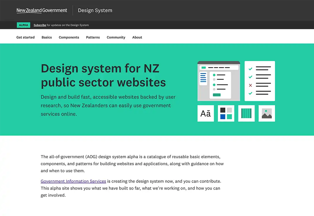
Many government websites are redesigned and rebuilt solving the exact same problems each time — but not always the same way. This leads to inconsistent websites that make it harder for us to use government services. Imagine you’re trying to use several different government websites that all look, feel, and behave differently: how easy would you find it to get the information you need?
We worked with the Department of Internal Affairs (DIA) to create the New Zealand Government design system (NZGDS), currently in alpha phase, to make it easier for New Zealanders to use government services online. The design system supports digital teams and agencies to prototype, design, develop and write content for fast, flexible, and accessible websites.
Its the first step towards a catalogue of reusable elements, components, and patterns. And, accessibility and usability are built into every level of the design, code, and content.
The NZGDS can be used to build websites or applications and, crucially, provides guidance on how and when to use each element, component, and pattern. This means digital teams can better focus their time on solving more important problems affecting their users.
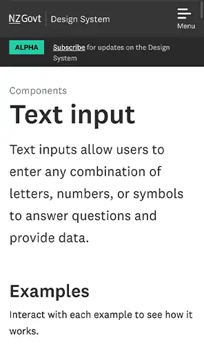
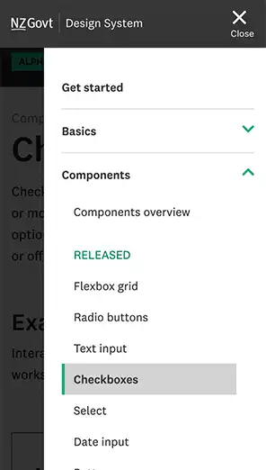
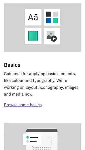


of
Our Approach A design system for all countries and codes
Other nations, including our Pacific Island neighbours, can directly re-use or build on our design system — its open source and available for everyone. We chose a generic government namespace of ‘g-’ for the CSS (the code that formats the layout of web pages), unlike other design systems that often have a nation-based prefix in their source code, which matches their web address — like ‘govuk-’ ‘usa-’, and ‘au-’. This means the source code can easily be used by any other government or organisation.
Build on (almost) anything with a flexible MetaTemplate
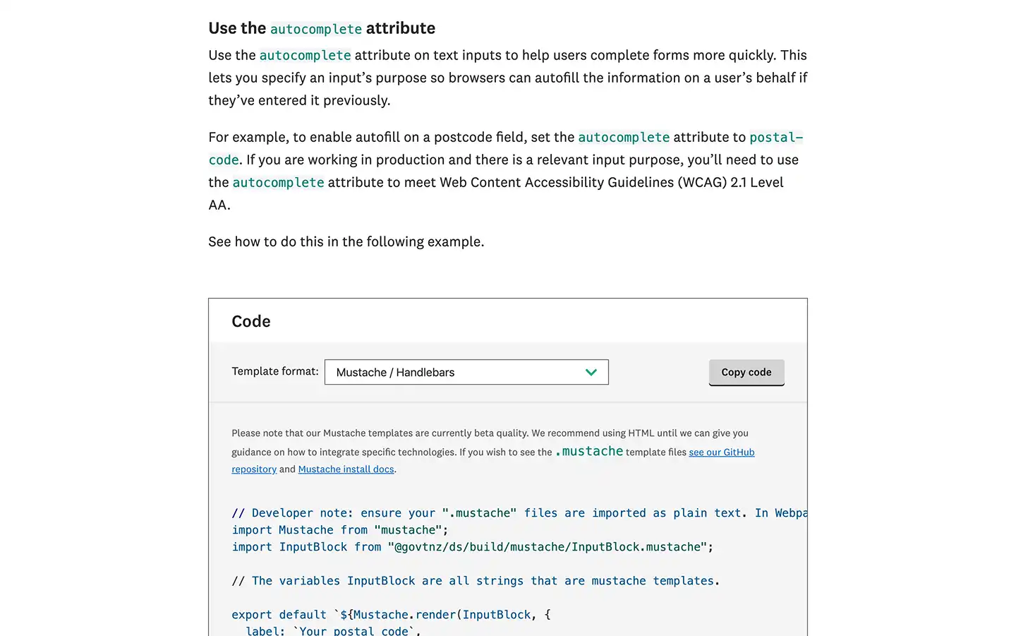
We developed a world-leading template converter software, MetaTemplate. It enables the NZGDS to supports HTML and CSS templates, but also React, Vue, Mustache/Handlebars and many more. It automatically converts the templates, allowing web teams to plug components directly into existing websites and platforms.
Here in Aotearoa New Zealand, many public service websites are built on the default government content management system (CMS) and framework SilverStripe. But for some webpages, developers might choose to use templates based on other frameworks to provide the interactive services increasingly sought after by their users.
Using MetaTemplate enables government agencies to use the design system on a variety of platforms, ensuring economies of scale and buy-in from the developer community.
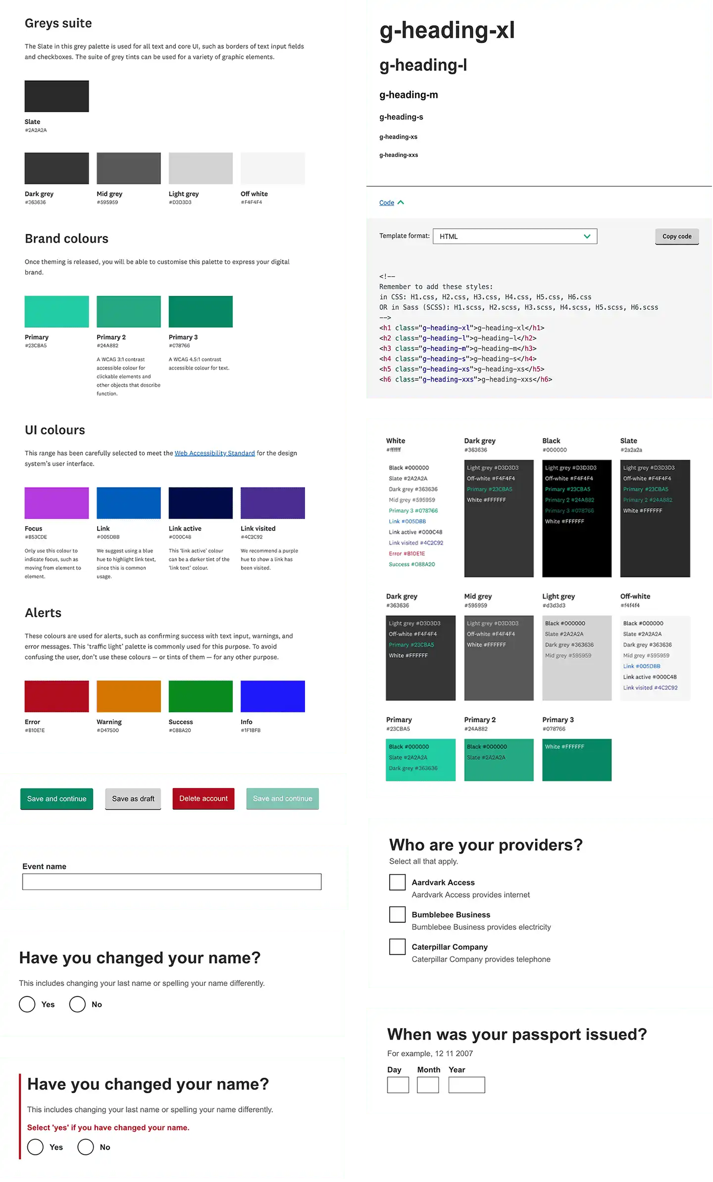
Driving best practice through accessible design
We built upon the open source GOV.UK Design System, which is a mature and proven system, supported by a high-level of attention to accessibility and testing. We began by comparing GOV.UK’s elements and patterns against the United States Web Design System (USWDS) and the Australian Government Design System to consider how best to approach each element.
Collaborating with NZ’s government community
The team learnt a lot through a collaborative co-design workshop of over 60 agencies and vendors, assembled by DIA. We considered their expectations, assumptions, and insights to ensure we were designing to meet their needs and — by extension — those of everyday NZ citizens. They’re our users’ users, and we focused on them while working on the design system. In particular, we considered accessibility throughout the design system, rigorously testing components to make sure they meet the needs of Aotearoa's diverse population.
We conducted initial user testing with a wide variety of developers, designers, content designers, product owners and managers — and their managers. We used their feedback to guide development of the alpha site, and to create a backlog for future development. This community engagement and feedback is key to a design system’s success.
We considered the unique requirements of an NZ design system by researching government websites, looking for common themes, approaches, and patterns. Building upon these aspects with consistency creates familiarity, which increases user trust and participation in government digital services.
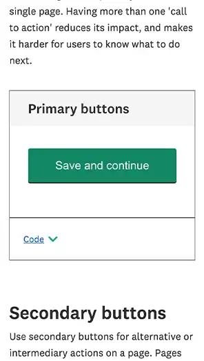
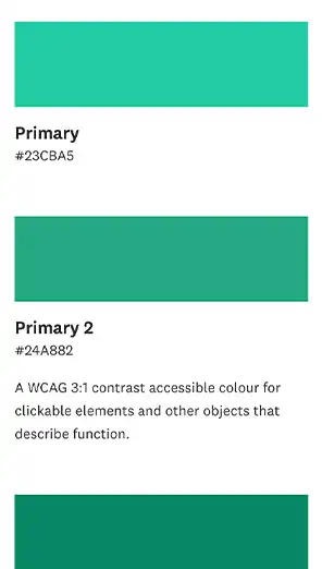


of
Meeting the needs of all New Zealanders
Research on how to incorporate te reo Māori is underway, with the aim of providing bilingual options for navigation, headings, and content.
Currently the alpha site offers seven components available to the public. We’ve been hugely motivated by the groundswell of discussion from the NZ digital community as well as government design system teams from the UK, Australia and the Netherlands.
Read more about the NZ Government Design System
Previous
MTF FinanceNext
ACC