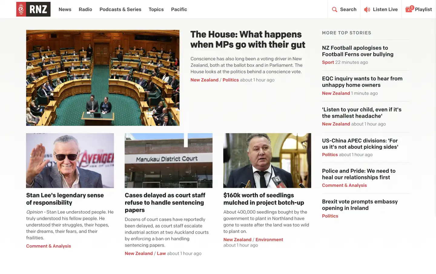
The Challenge Evolving RNZ into a 24/7 online news provider
In 2016, RNZ asked us to lift the profile of their online news content so it better served their audience wanting up-to-the-minute news.
They had quickly evolved into a digital news-producing organisation in the same manner as Stuff, the BBC, or the Guardian. The major difference – the website’s design didn’t prioritise their news content.
We sought to provide a mature website design that gave their high quality journalism the greater prominence it deserved.
We’re absolutely delighted with the site’s new modern face and the reaction from our audience. We are already seeing the benefits and want to keep building on the big improvements.
Head of Digital Media, RNZ
Our Approach Co-locating for collaborative design
How do you find out what a 21st century news website needs? By putting yourself at the heart of the newsroom itself. Our design expertise went in-house so that work could be carried out collaboratively with RNZ’s development and design team.
Embedding among journalists and producers made it easier to research and respond to their needs. Their feedback – and that of RNZ’s loyal listenership – allowed us to create a strategy for restructuring and redesigning the RNZ website.
Reflecting a strong sense of identity
Our embedded design expertise guided and supported RNZ’s in-house design team through the process of defining a recognisable aesthetic. We went with a limited palette, no-nonsense typography, and a distinct image treatment that’s easy to roll out.
Improving content discovery
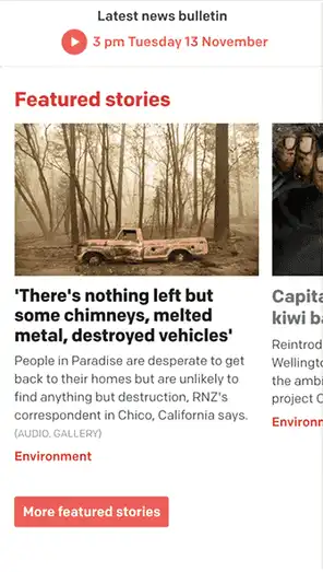
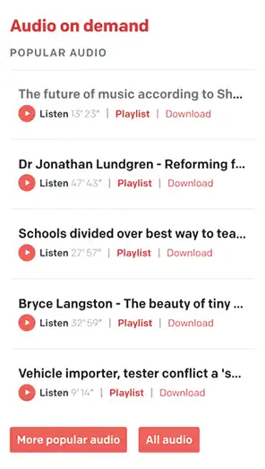
Audio is consumed in many different ways – not just broadcast radio. Our challenge was to unpick many schedule-based structures and improve content discovery through a web-centric information architecture. We introduced more visibility to the metadata of published stories through kickers and other visual cues. This allowed users to search for and find content by location, subject, format, medium, and tone.
Building a system for storytellers
A media site has relatively few basic building blocks – mostly you’re working with stories, grids of story teasers, or lists of story teasers. However, within each of those is a range of formats, with variation in the type of content and layout. We created a component-based design system to provide varied and interesting ways for users to explore the site.



of
The Results Serving a growing audience in style
The redesign helped to deliver more visits to news content. This growth was driven by increased content publishing and reinforced by a solid social media presence – with no advertising. RNZ now have over 100 journalists and content producers pumping out stories 24/7. More content, more people, more clicks.
Between 2016 and 2017, RNZ’s website experienced significant growth in visitors and sessions.
46%
increase in total website users
54%
increase in total page views
70%
increase in total sessions
Previous
NOW NZNext
New Zealand Red Cross