The challenge Supporting school leavers to take the next step
Finishing high school is a huge milestone, but what comes next? 60,000 young New Zealanders leave school every year. They want to know more than which uni to apply for or the pros and cons of a gap year — they want to know what to look out for in a lease agreement, what constitutes a healthy relationship, or how to enrol to vote. They want support to make smart, considered choices.
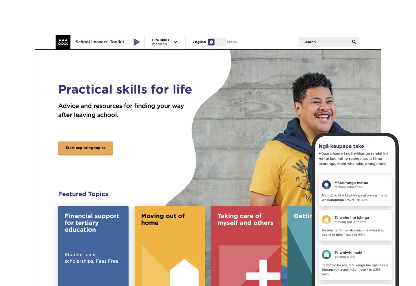
We designed and built the Ministry of Education’s School Leavers’ Toolkit — a website that provides young people with a toolkit of essential life skills from housing rights to mental health.
Our approach Collaborating on design with school students
The site needed to be a place where school leavers could feel reassured about their future and learn about their rights and options available to them. We discussed and tested the toolkit in depth with school students to work out what information they wanted the toolkit to contain, as well as the look, feel and user journey. This user testing phase was essential for ensuring the toolkit actually responded to school leavers’ needs, answered their questions, and provided them with further information they may not have realised they wanted to know.
The user testing also determined the visual language of the site – contrary to our initial belief, we found that students deemed fun graphics to be childish – they wanted to be treated like adults. They responded instead to aspirational photos, bright block colours, and minimal text.
Designing for a mobile generation
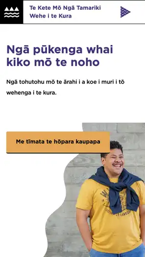
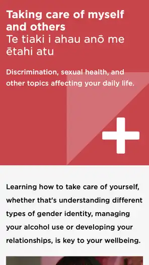
We knew that users would predominantly be on their phones, and so we built and designed the site with the mobile experience at the forefront. We used Content Distribution Network features to enhance the download speed of the site so that it works quickly over slow mobile connections, and minified and compressed files and optimised images.
Accessible and bilingual
Accessibility was key so that users of all abilities feel confident and included using the toolkit. We ensured navigation around the site was simple and intuitive, functions were clear and text was easy to read. We collaborated with Wrestler who produced the videos for the site, and incorporated transcripts below the videos in accessible accordions, able to be opened by the user as needed.
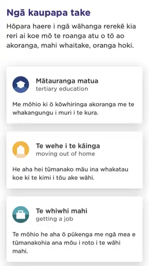
We made the toolkit a fully bilingual site, with all content able to change to te reo Māori by a clearly-marked switch in the navigation panel.


of
Outcome A genuinely useful toolkit
A new, fully bilingual and accessible website that answers the real questions school leavers have — designed with them, for them.