What we're proud of
2.3%
increase in session numbers
An evolved brand that appeals to young people
A separate site for Service Providers, that doesn’t interfere with the Youth site search engine results
Trained Youth Service coaches to do user testing remotely all over the country during the COVID-19 2020 lockdown.
The challenge Make a government service appealing to young people
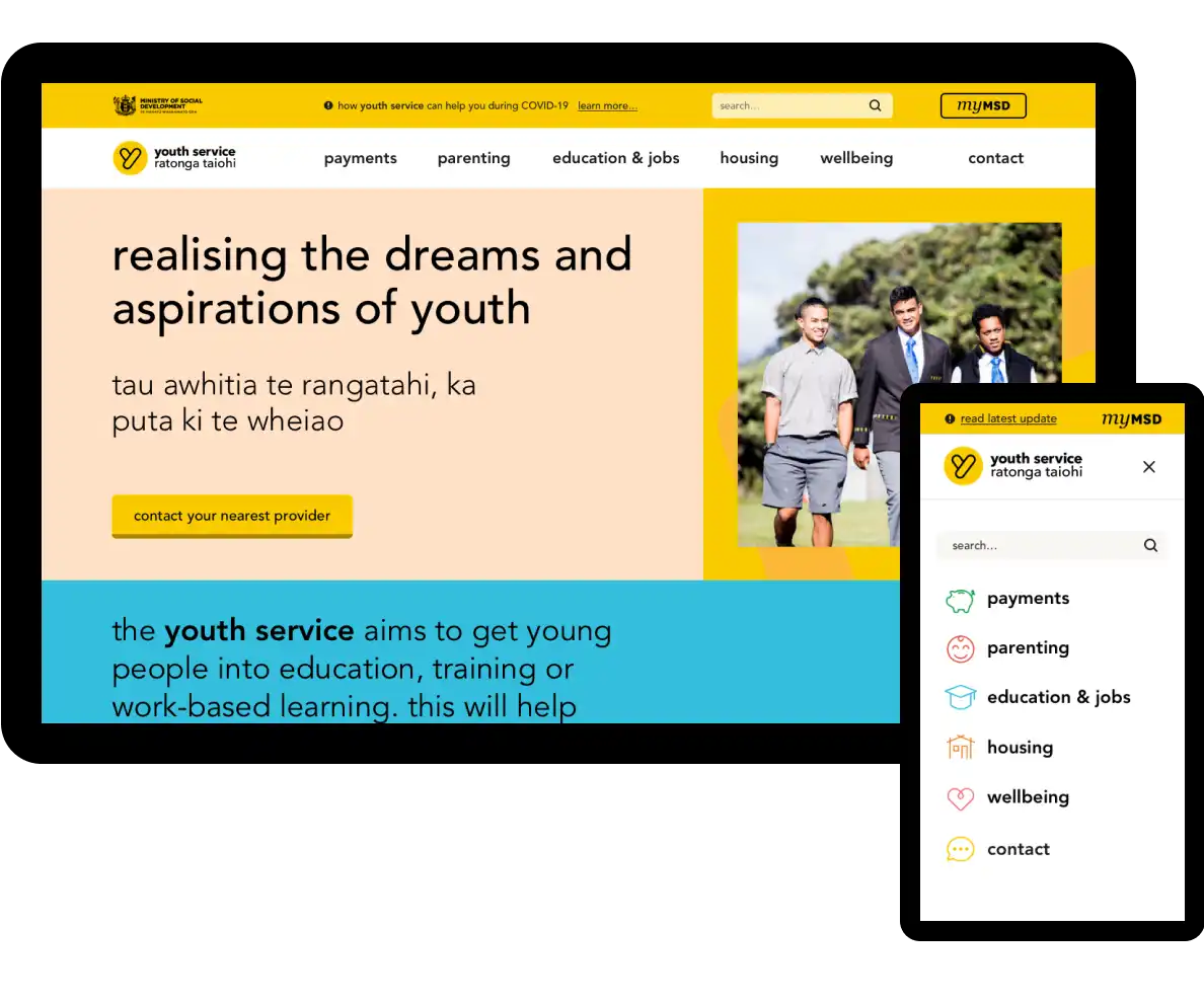
Youth Service Ratonga Taiohi is a Ministry of Social Development (MSD) initiative that helps Aotearoa New Zealand’s youth gain independence and confidence by connecting them to the support and services they’re entitled to, including the youth benefit.
MSD needed a refreshed, modern website that would appeal to young people, and also give the service providers information they need.
Our approach Colourful and usable, with a human-centred approach
We applied our human-centred approach to evolve the brand, making the site appealing, useful, and usable for both the young people and the service providers using it. And we did all this during 2020’s nationwide lockdown!
Evolving the brand
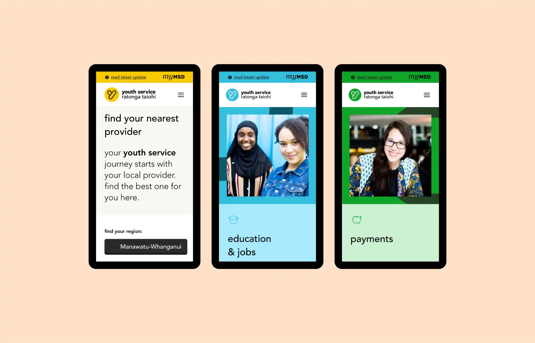
We wanted to keep the essence of the brand while updating it to feel empowering and professional to young people on a journey to figuring out the next step in their lives.
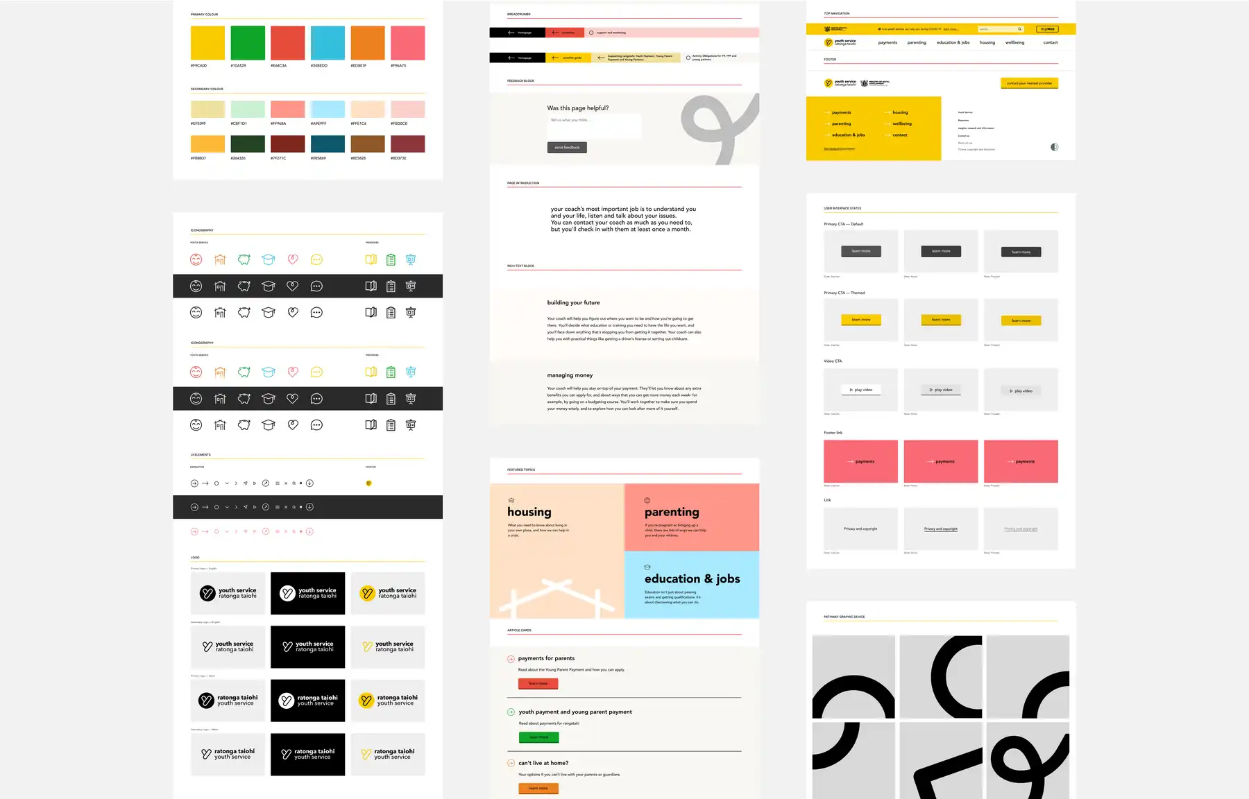
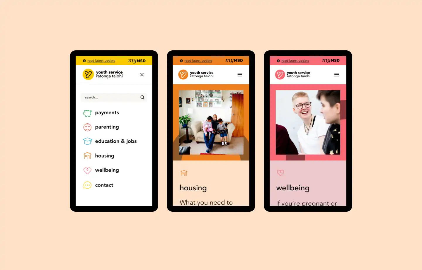
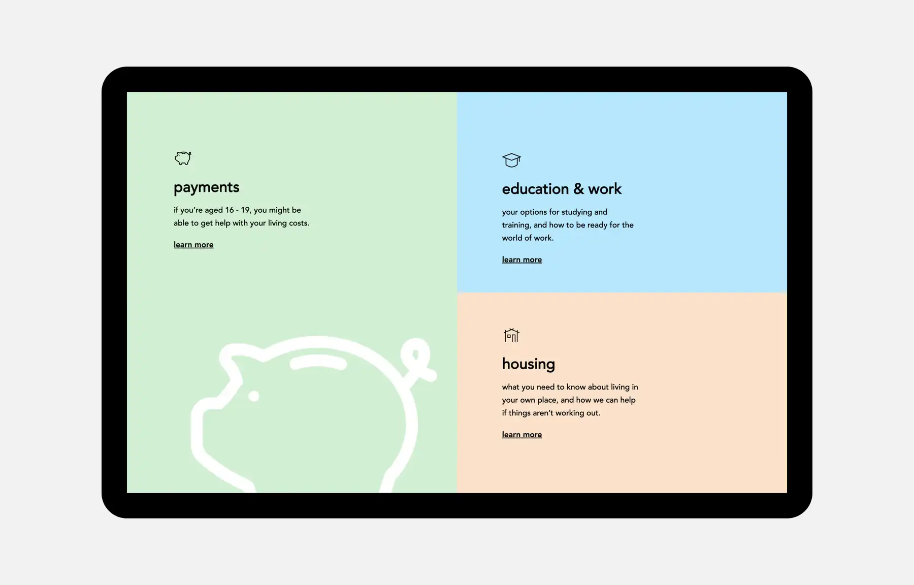
We pared the logo down to a single ‘Y’ that retains the original bubble-like shape. The logo’s original colours now theme different sections of the site — like pink for mental health and orange for housing. The colours give the site an optimistic, upbeat feel.
Finding your path
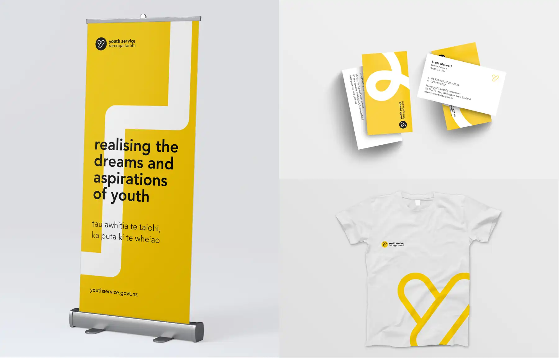
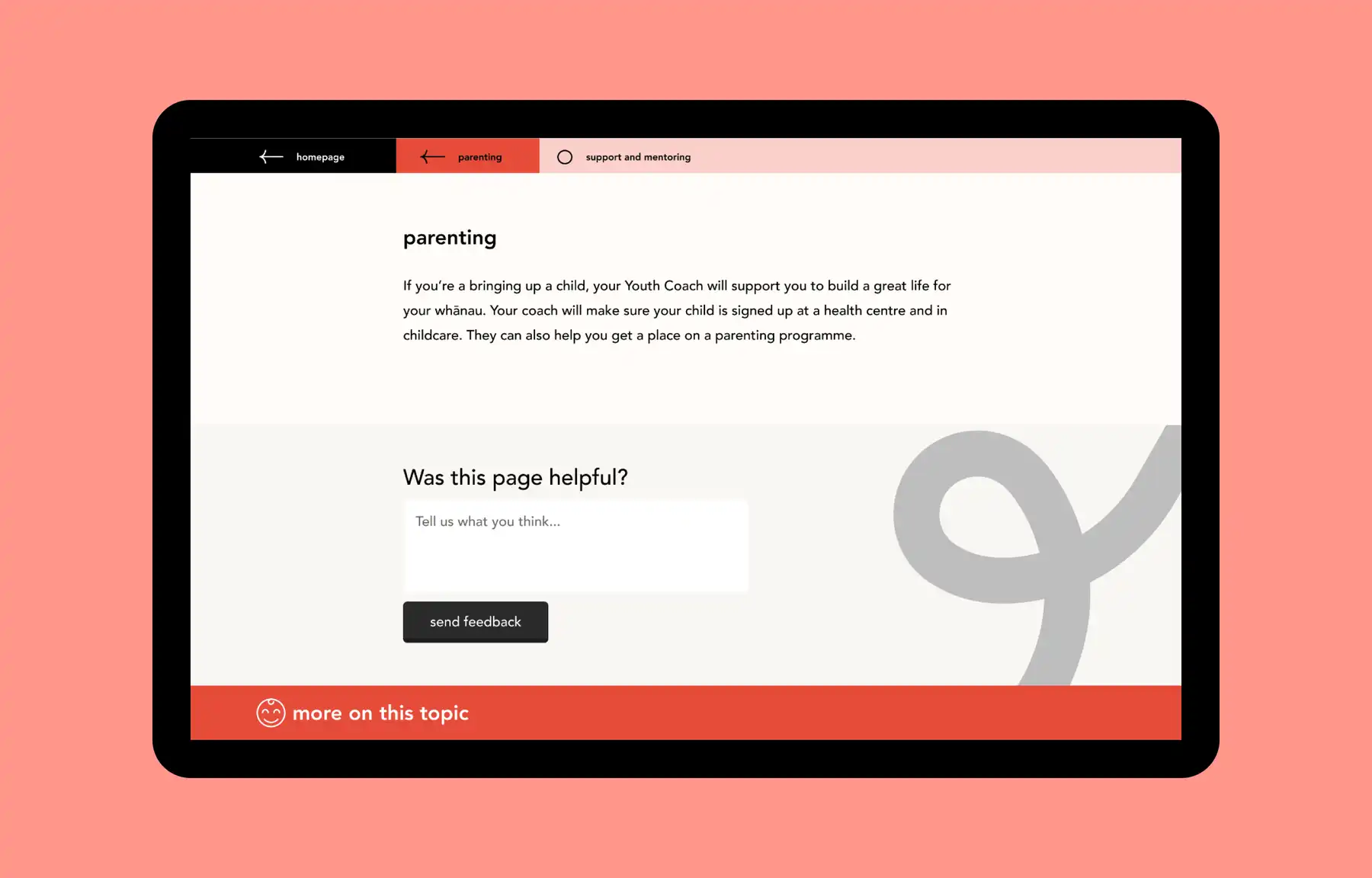
Youth Service’s goal is to help young people get on the path to becoming who they want to be. Our visual designer created a path motif that weaves through the site, in the background. It gives the subtle message of progress and keeping on track.
The new brand is also being rolled out in the real world, across Youth Service's print and merchandise.
Supporting Youth Service coaches to do user testing
The project had a tight timeframe and budget, and a lot of it was done during 2020’s nationwide lockdown. We needed to do user testing with young people who use the site, but we didn’t have time to develop the rapport needed for them to trust us and give honest insights. So we trained Youth Service coaches, who already work directly with the young people, to carry out user testing across the country.
Supporting MSD to do the user testing themselves was a great way to fast-track it, while still getting quality insights.
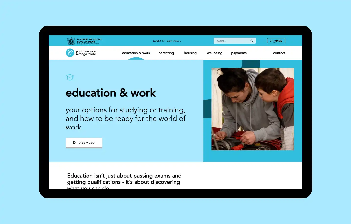
A visual language young people recognise
We knew that most young people would be looking at the site on their phones, so we designed with mobile at the forefront of our minds. In user testing, young people really responded to images, and mentioned Instagram as the website style they liked the most. Inspired by Instagram’s aesthetic, we made the images square, kept them free from any overlapping, and made all the text as short as possible.
We gave the MSD content writers advice and resources on how to make content scannable and mobile-friendly — like having short, to-the-point sentences. All the copy is lowercase, making it feel friendly and approachable.
Using remote collaboration tools during lockdown
As we were working remotely in level 4 lockdown, we synthesised the user testing findings as a group using virtual whiteboard Miro. The Miro boards generated insights that provided our designer and content strategist with direction on content, brand, UX, and design.
Incorporating these insights made the new website much easier to use, especially in 2020 — a year when more young people needed its services and information than ever before.
A Silverstripe CWP 2 build
Youth Service’s content management system is a CWP 2 build. We collaborated with the CWP and MSD IT teams to coordinate the technical environment setup, and create a development infrastructure that enabled an Agile development lifecycle, so we could get things done quickly and efficiently.
Two independent sites operating as one
The site has two key user groups — young people looking for support, and support services themselves. Each group has different needs, so we made two independent sites that look like one, using Silverstripe’s subsites module.
This allows us to host the different content under two separate domains, while using the same code and components for both. The youth-related content is discoverable by search engines, while the services-related content is hidden — so it doesn’t interfere with search engine rankings and young people don’t get sent to pages that aren’t useful for them.
The result An approachable and helpful service
With its modern, mobile-friendly design, and clear content, it’s now easy to find information and services on the Youth Service site.
And we're delighted that the website won Best Plain English Website, Public Sector at the Plain English awards 2021!
From the start of the project, Springload were engaged and showed a real passion to create a website that would help our rangatahi.
Senior Advisor, Youth Service
Previous
ACCNext
Te Hiringa Hauora | Health Promotion Agency